


ELEMENTS DESIGN
Case Study
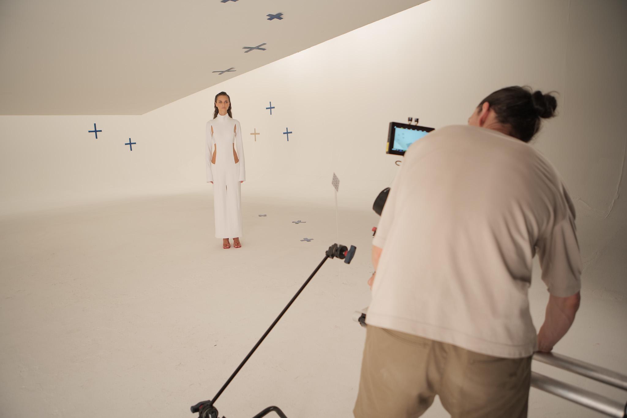
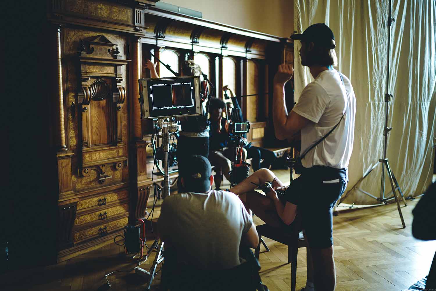
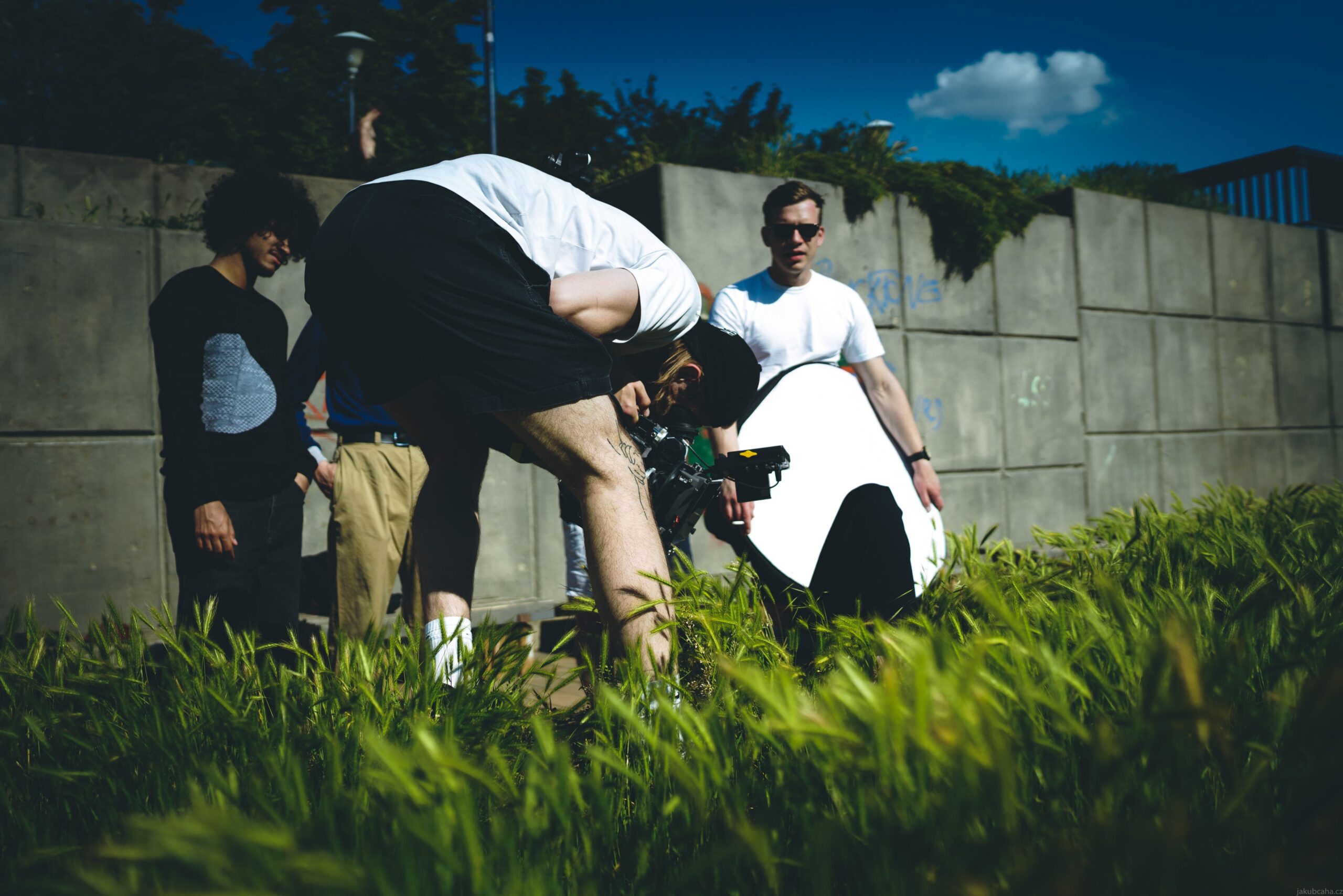
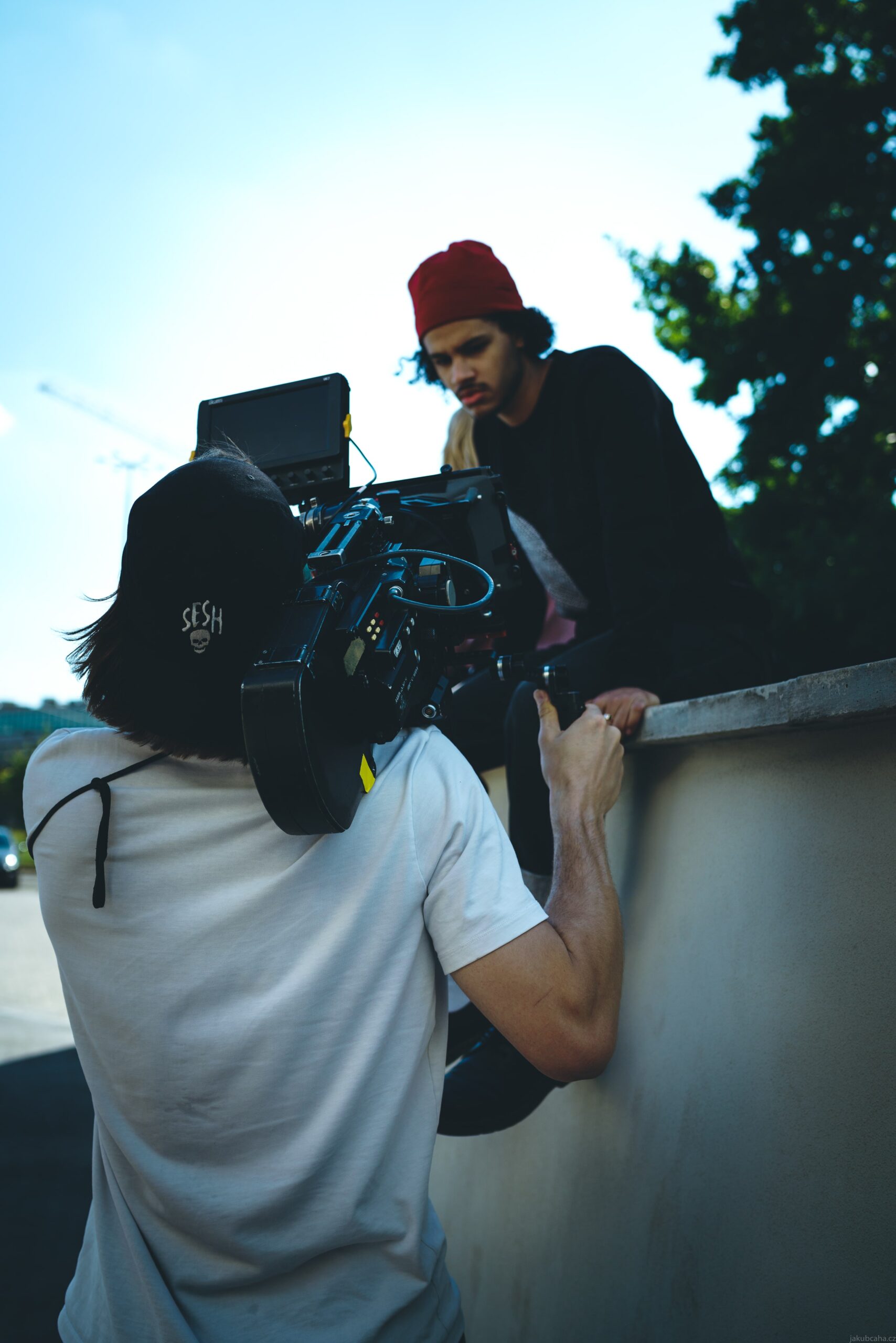
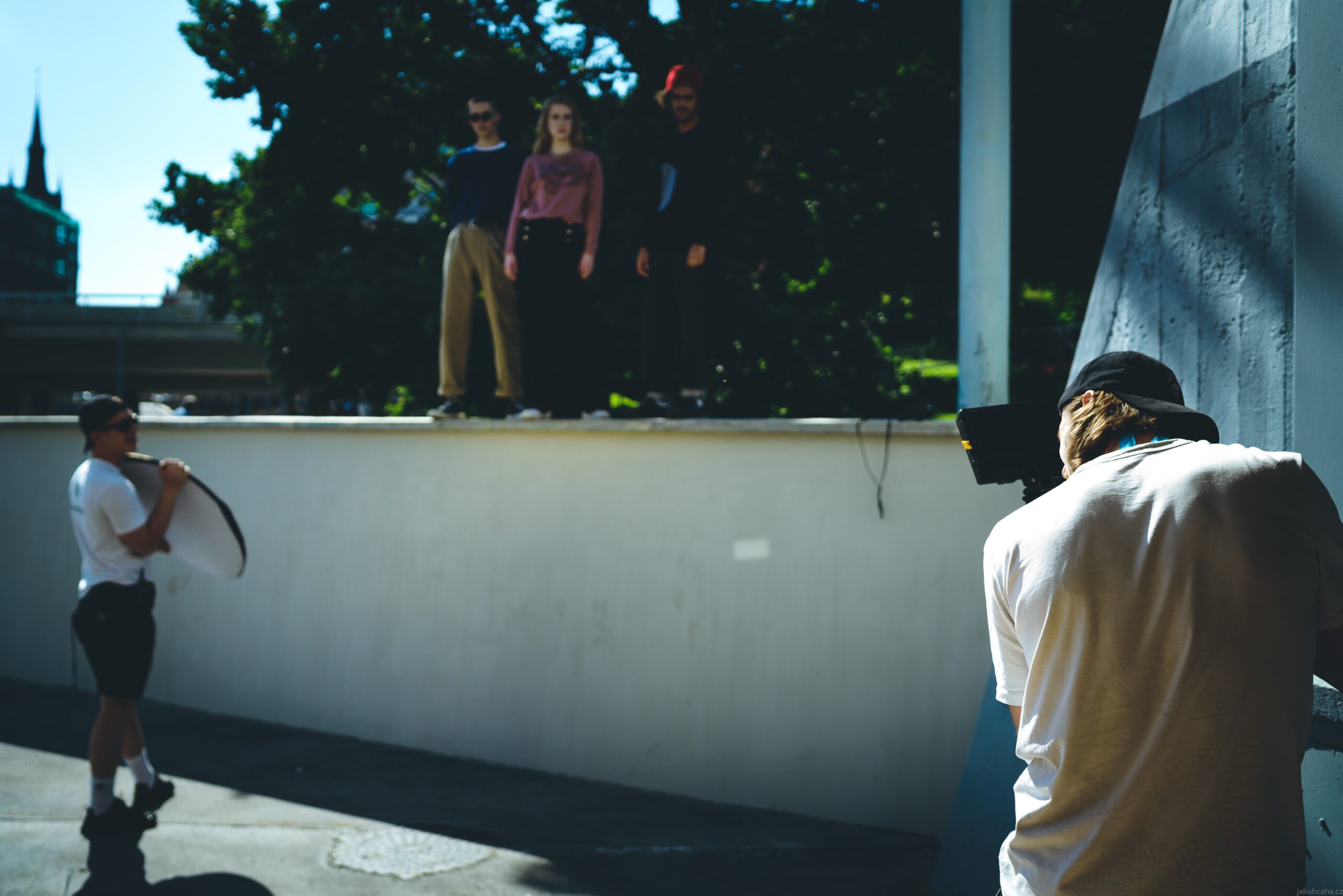
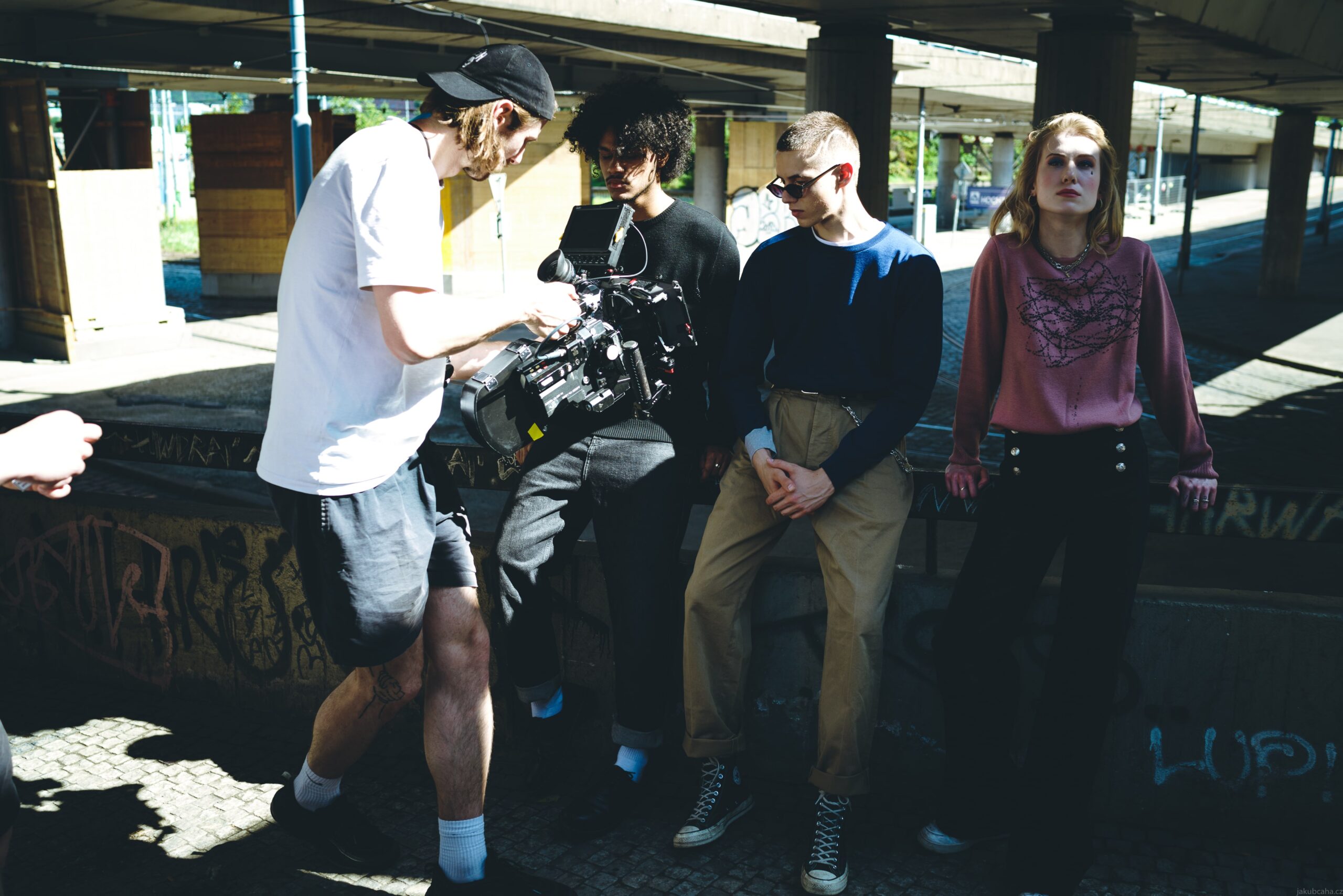
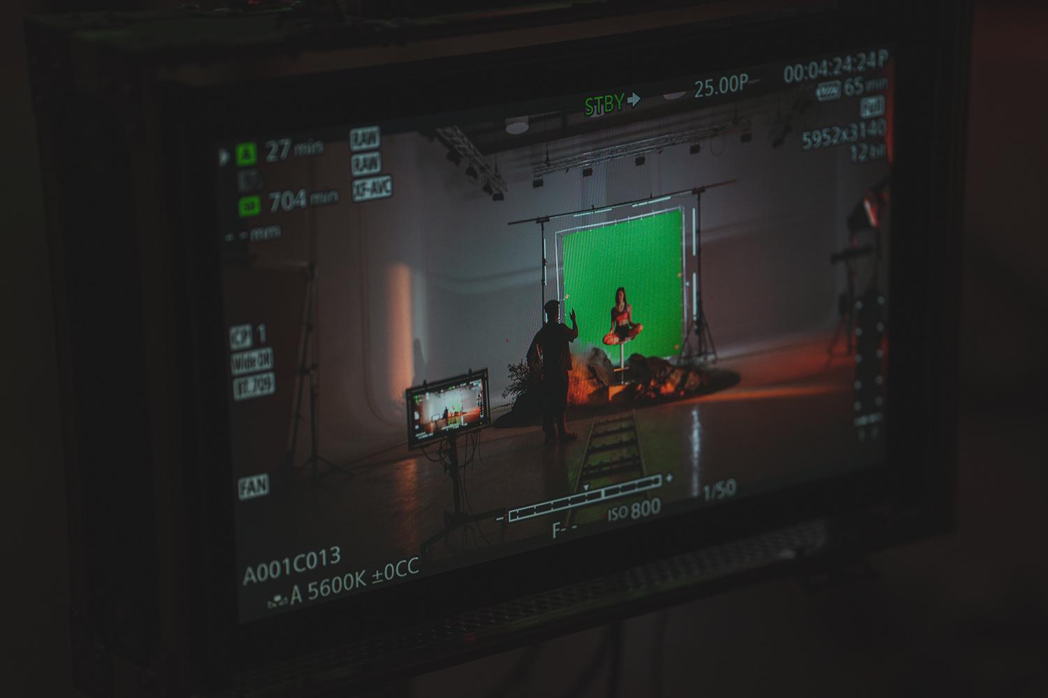
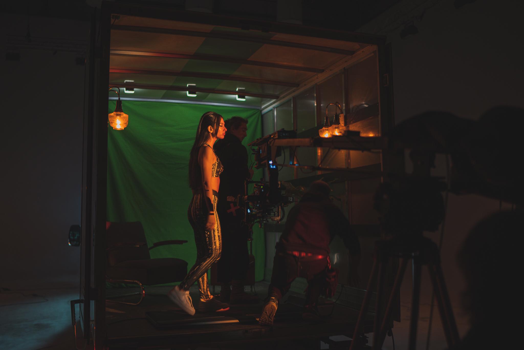
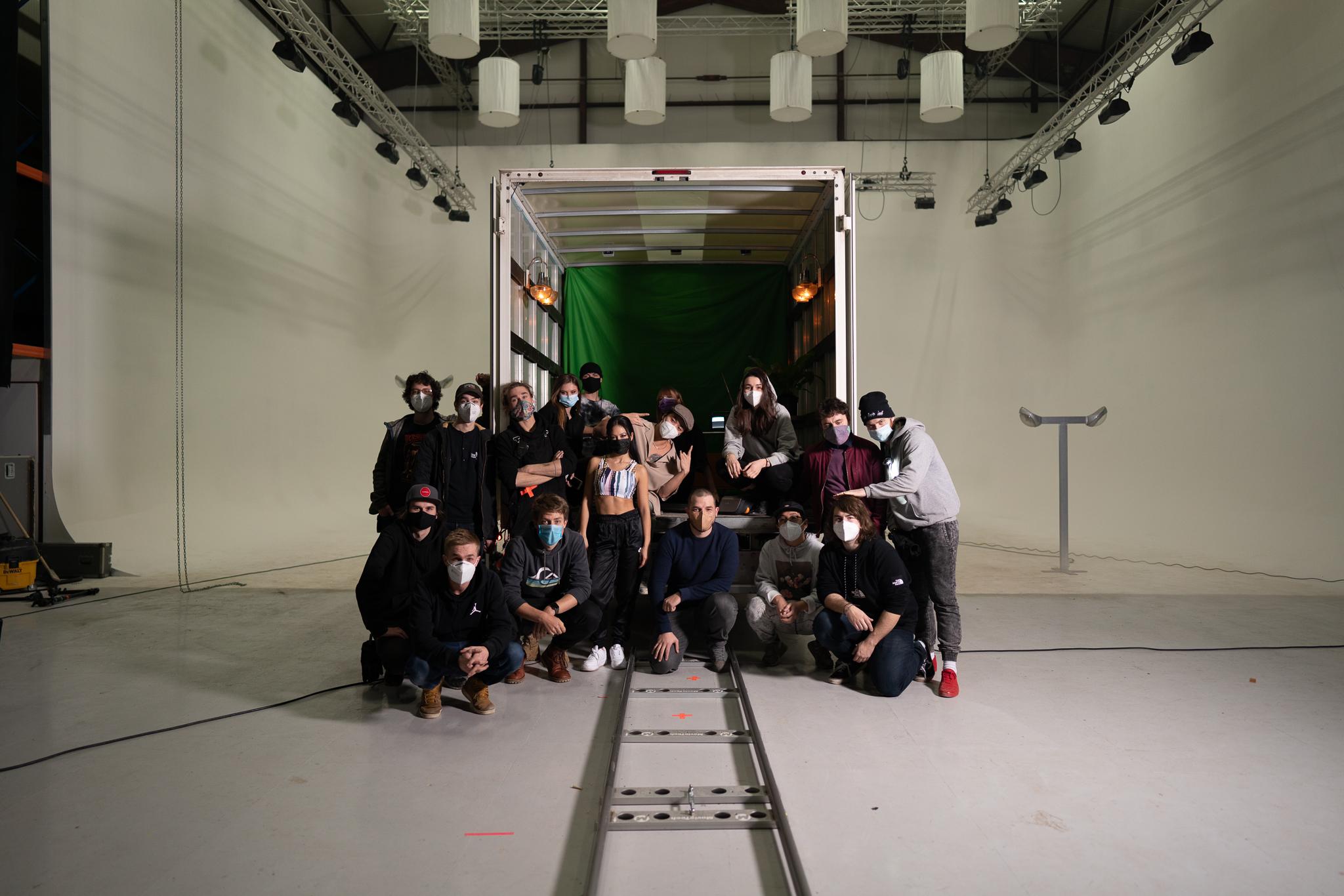
At Unreal Visual, we had the privilege of creating a brand video for ELEMENTS DESIGN, a name synonymous with luxury custom-made kitchens. Our task was to not only capture the essence of the product but to create a visual experience that resonates with the aesthetic expectations of potential clients.
ELEMENTS DESIGN – When Luxury Becomes Art
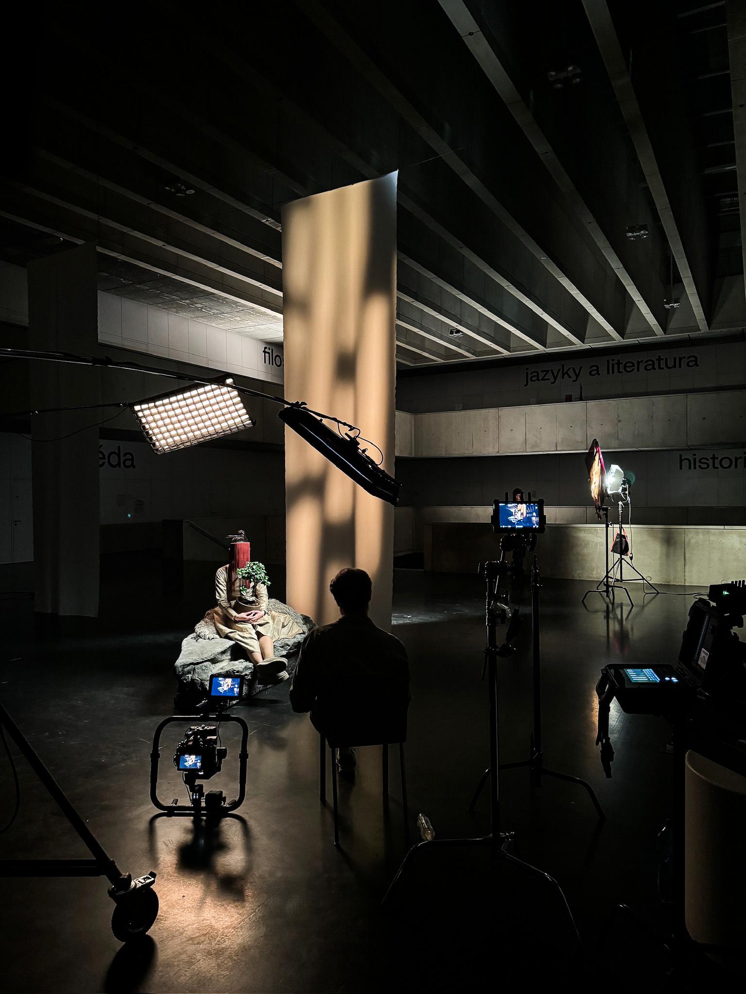
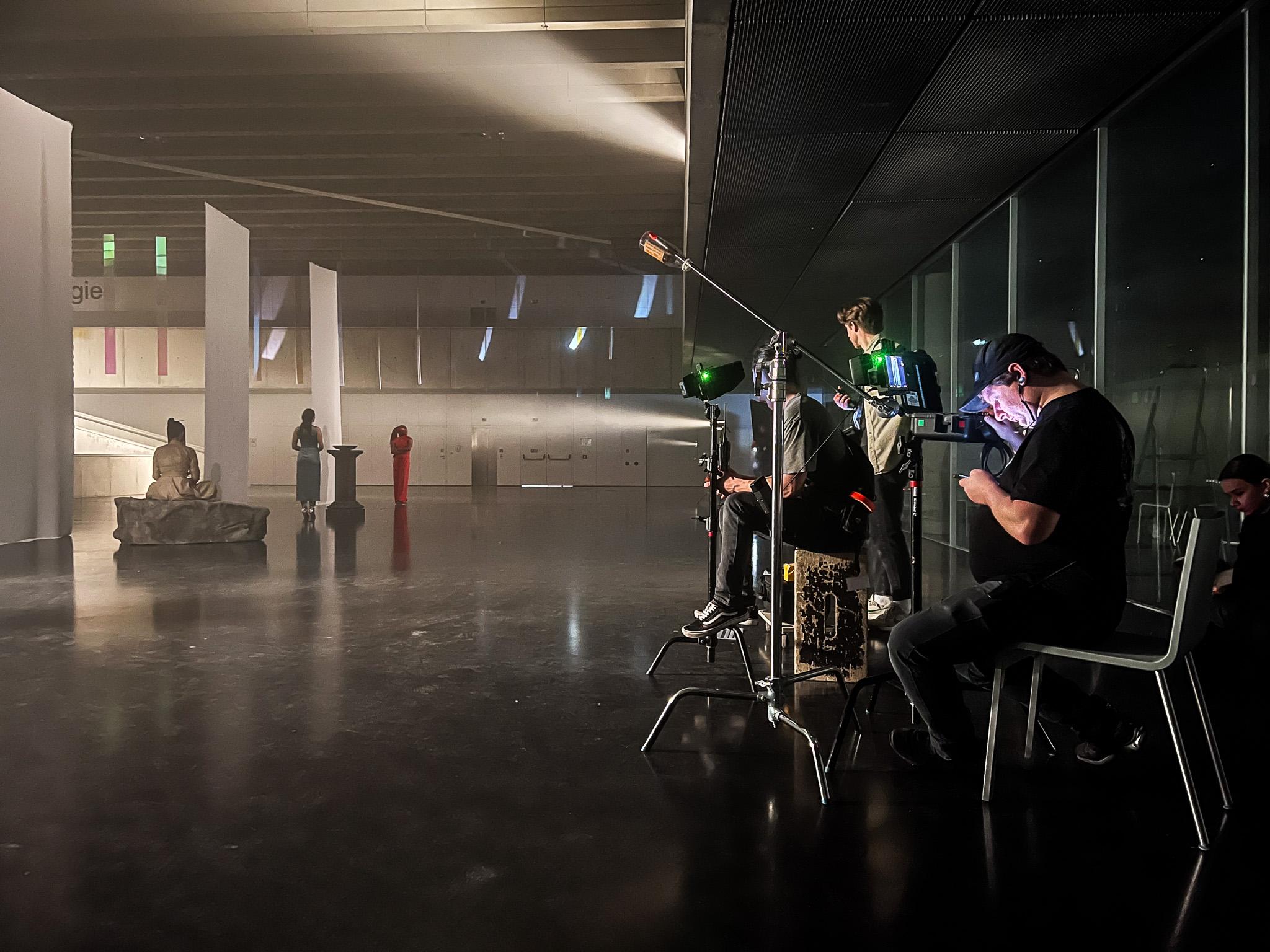
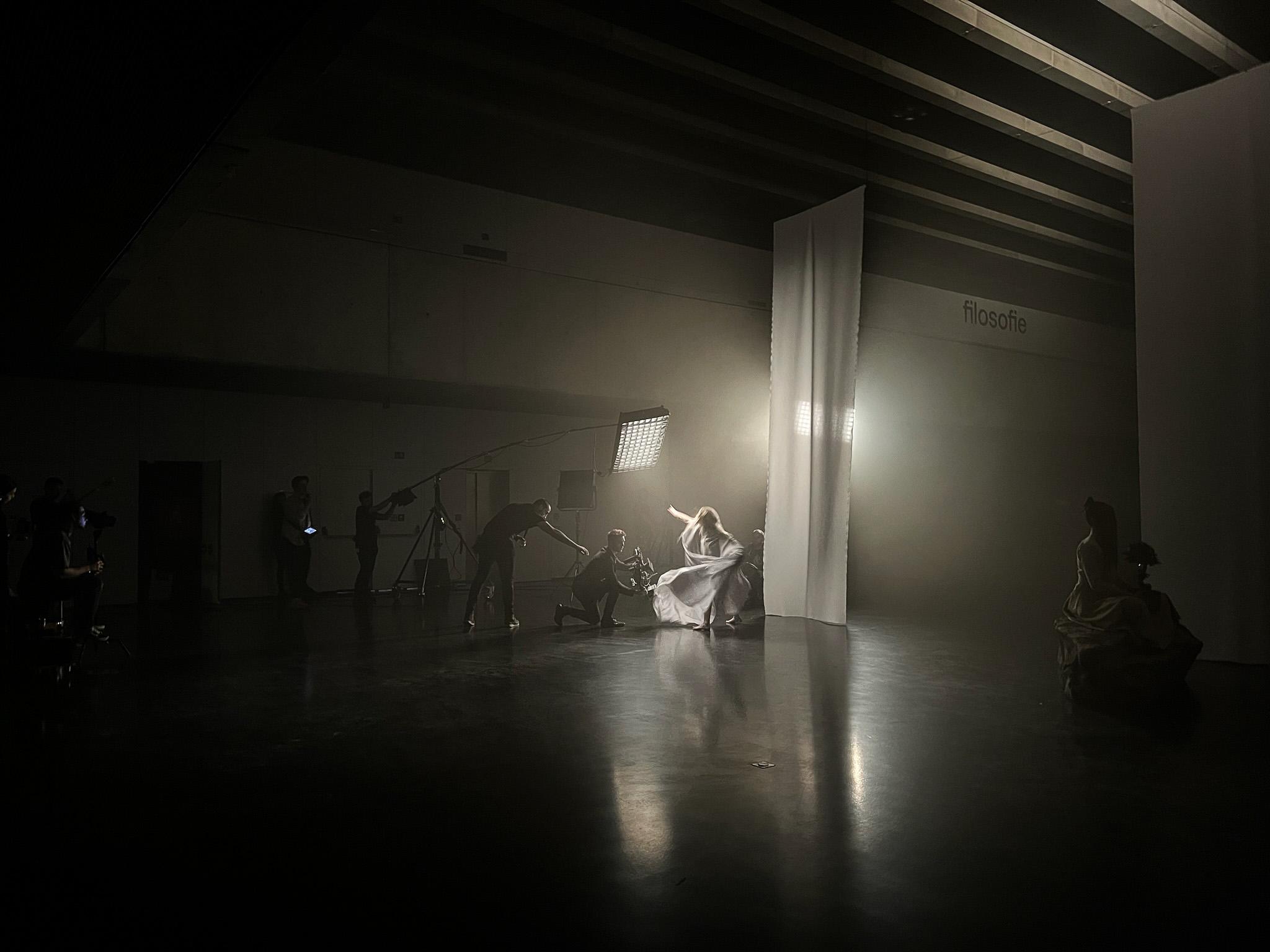
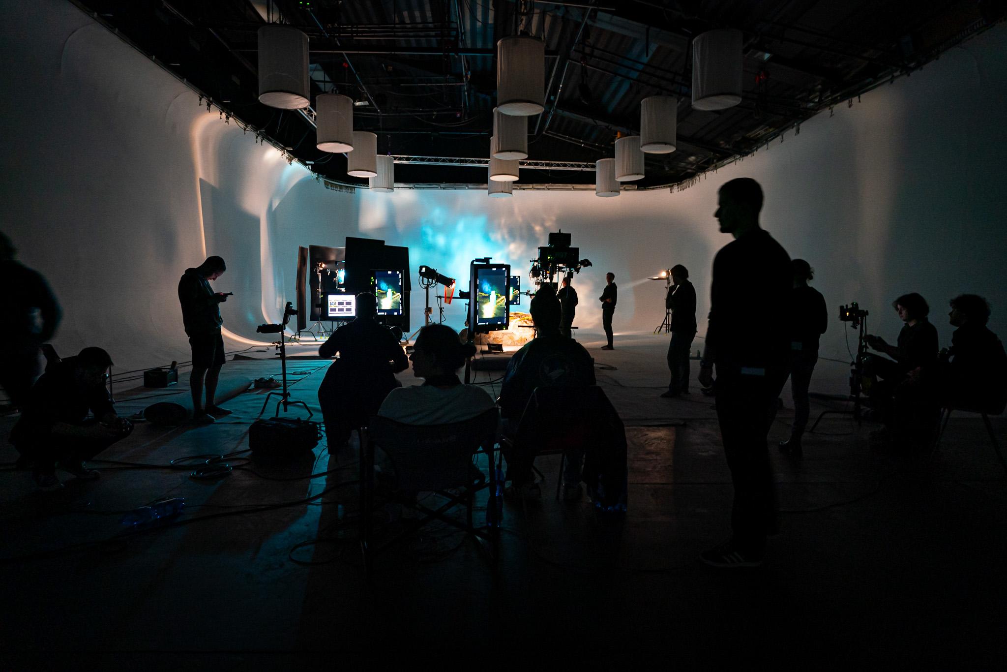
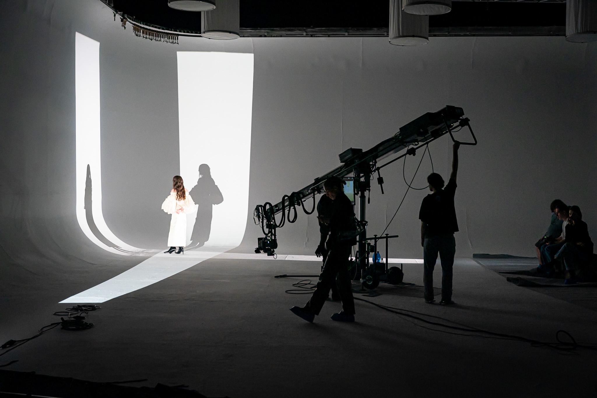
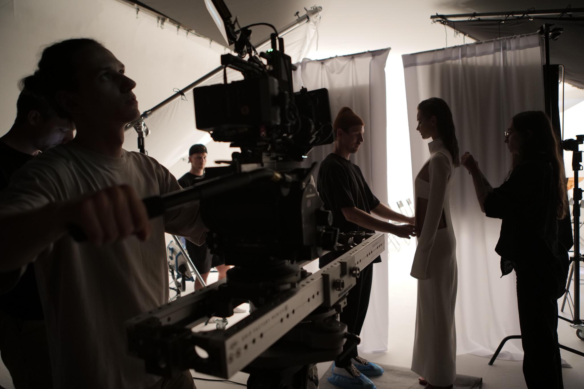
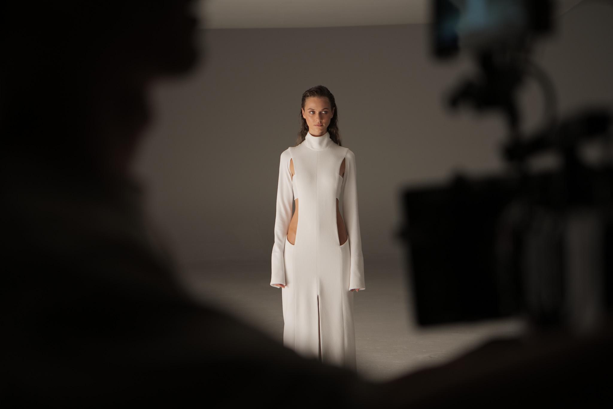
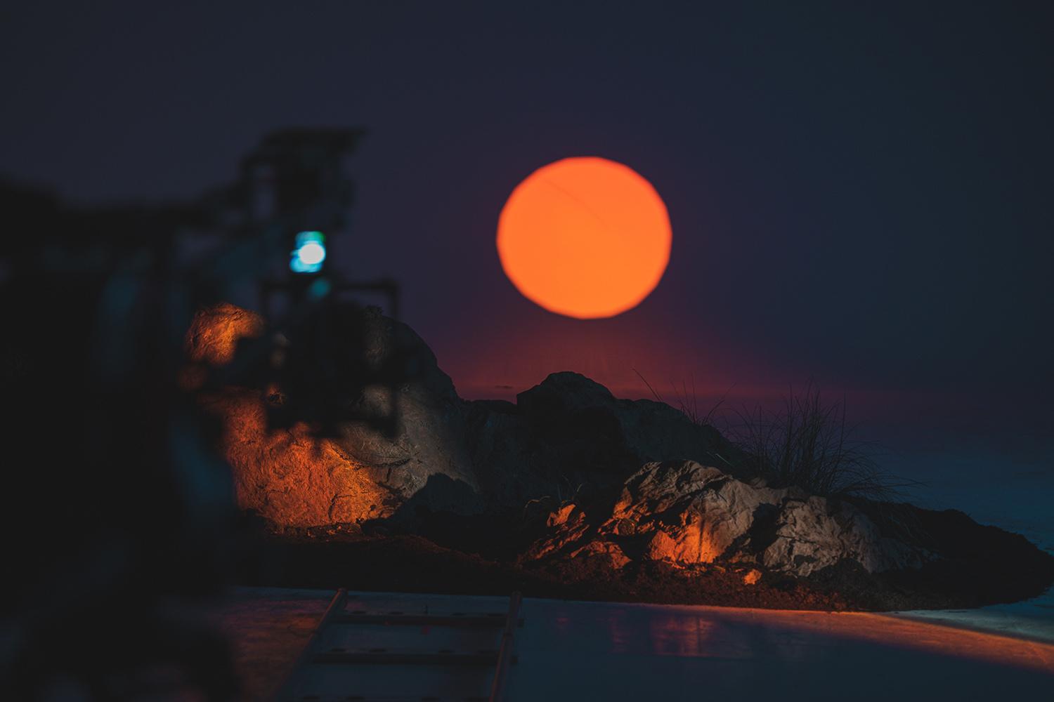
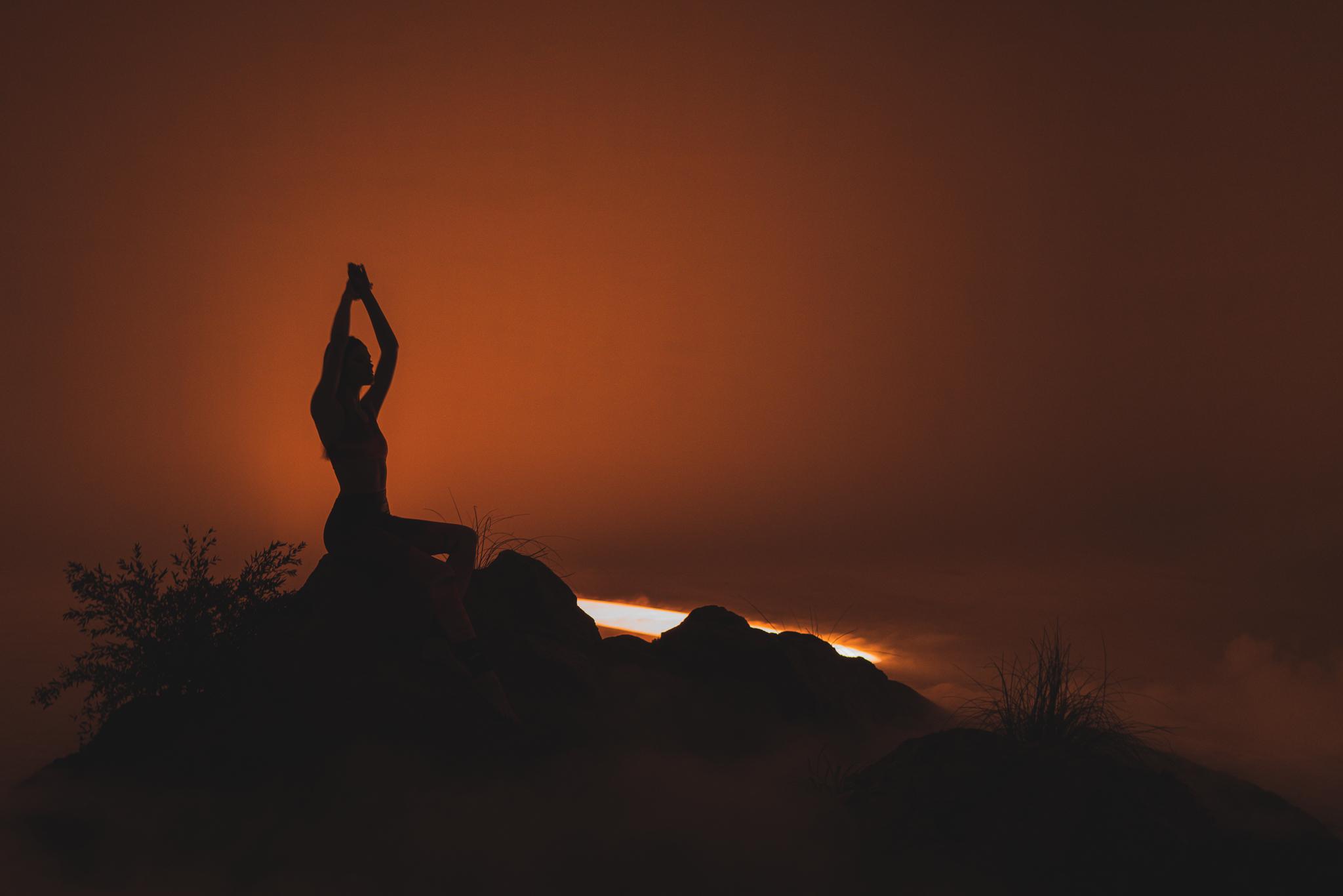
ELEMENTS DESIGN kitchens are not just about functionality, but about creating a space where design merges with art. The central idea was to present the kitchens not merely as luxurious items, but as living galleries where each element has its own story. At the heart of our concept is the embodiment of luxury through an artistic narrative. We focused on connecting the product with natural elements and basic human senses, reflecting the brand’s deep relationship with aesthetics and design.

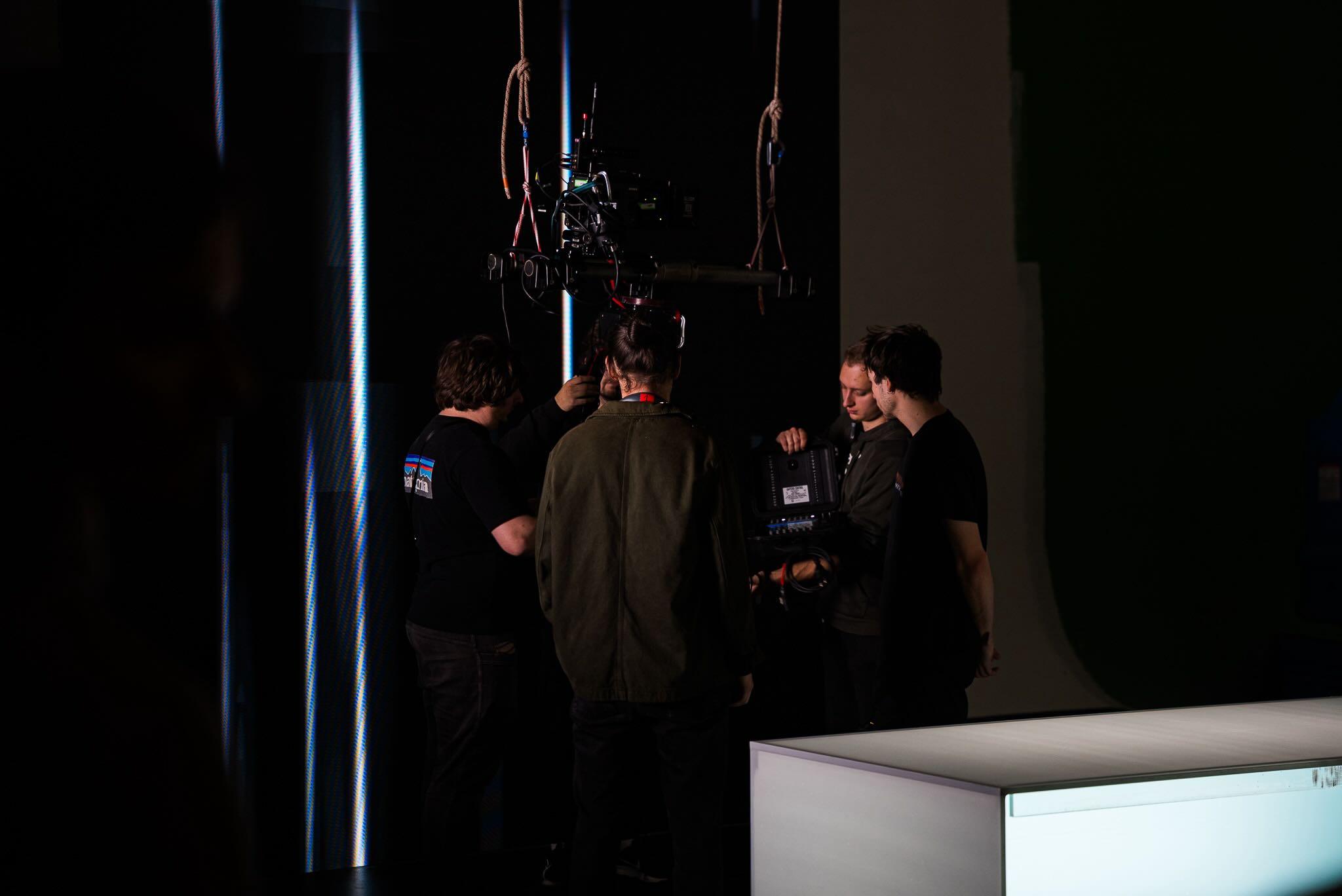
At Unreal Visual, we were responsible for creating the main brand spot and its shorter versions, in formats 16:9, 1:1, and 9:16, both in Czech and English language.
Creative Process – The Story
Visual poetry and metaphorical depictions of natural elements guide the viewer through a story where luxury kitchens become works of art. Our narrative revolves around a man who symbolizes the ideal customer—aware of quality and design, expecting a superior product and service. His journey through the gallery represents an emotional connection with the product, where interactions with the elements of nature (fire, water, earth, air) reflect the brand’s philosophy.
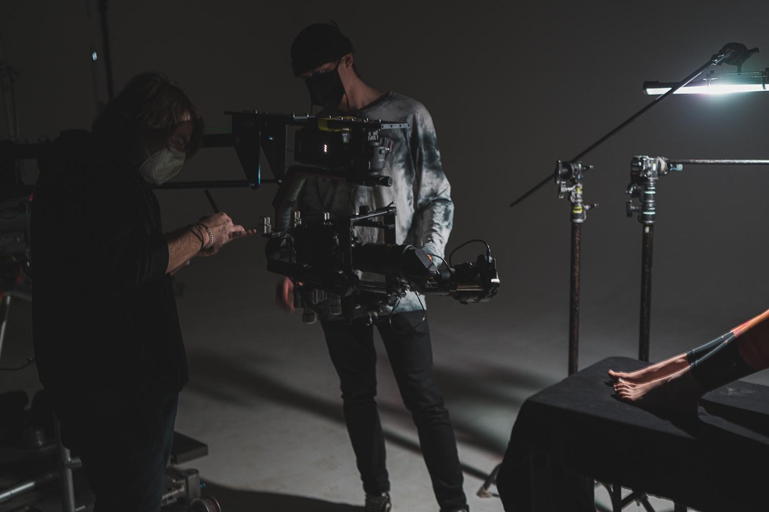
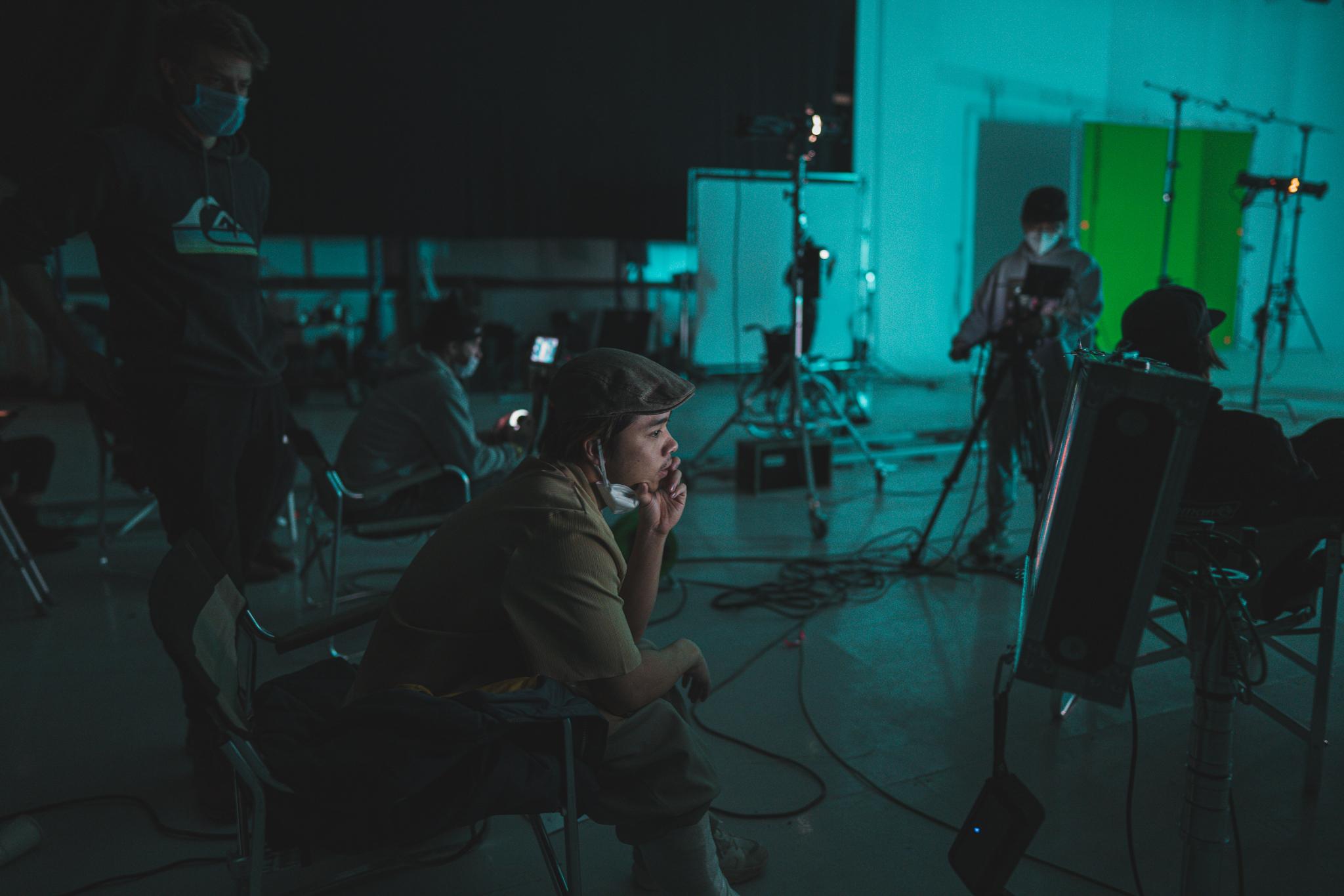
Visual Styling
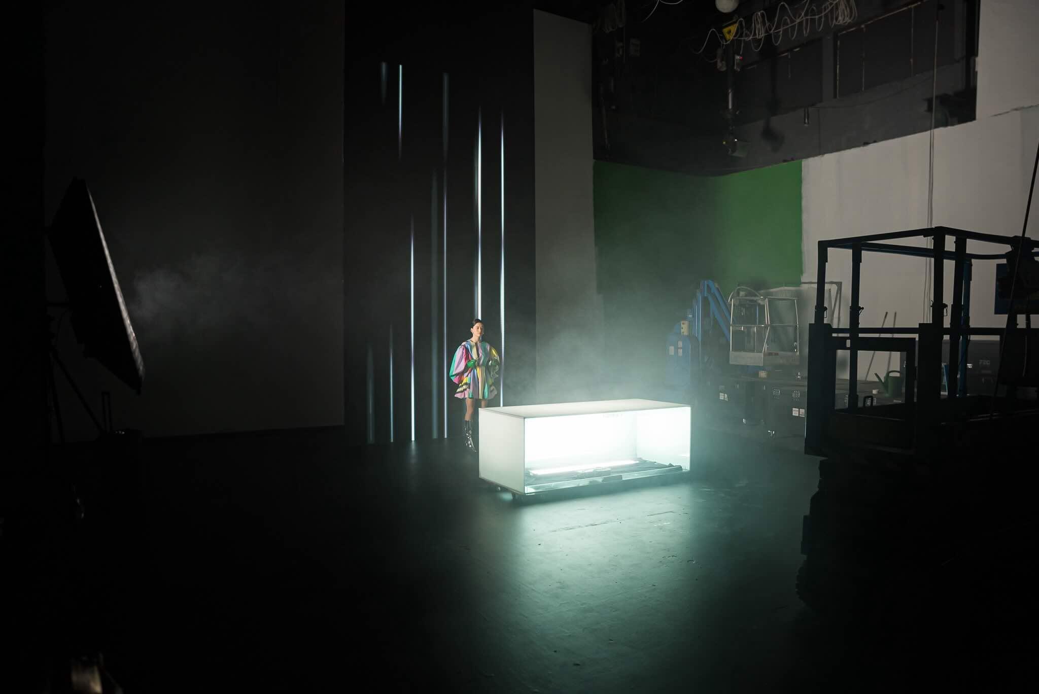
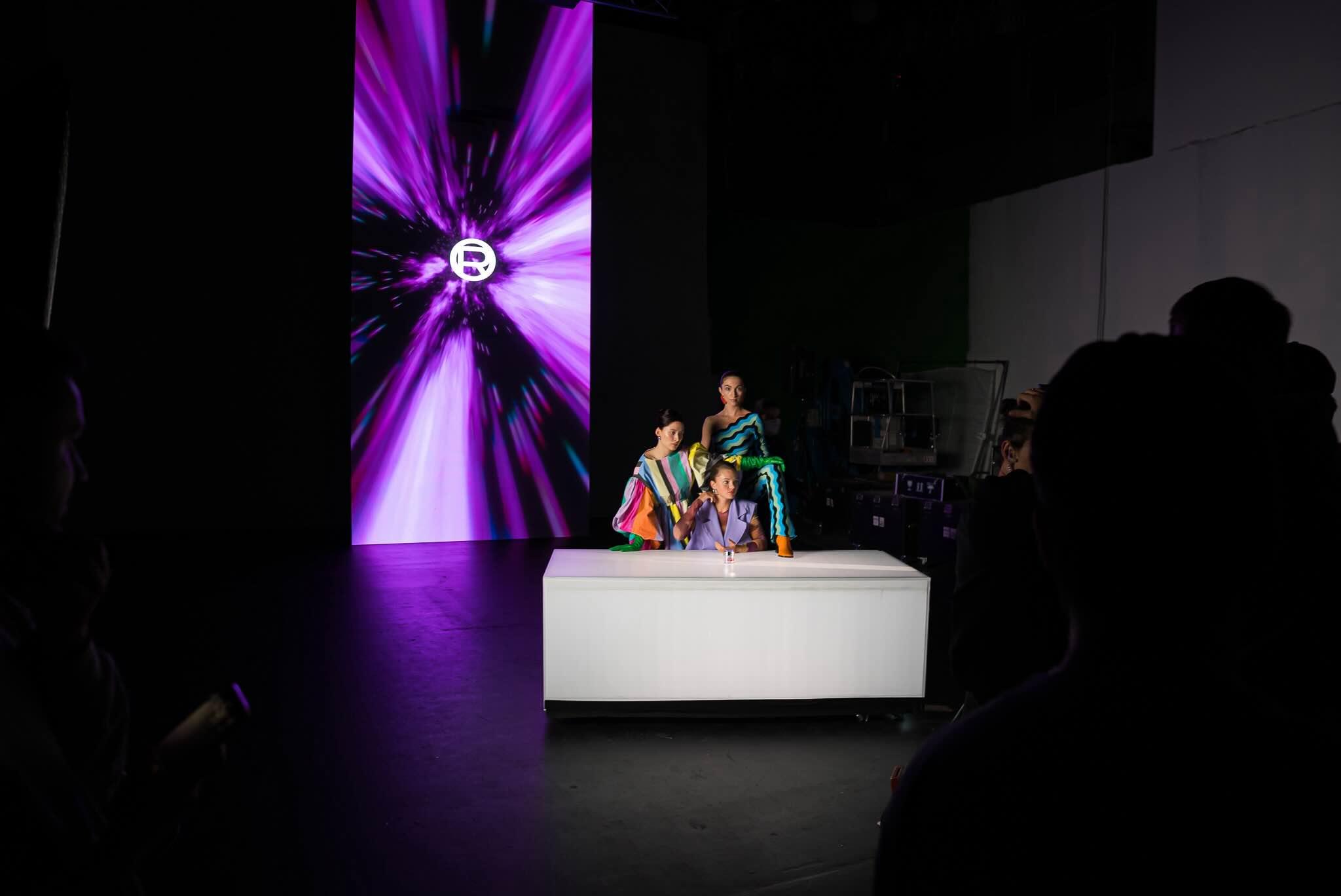
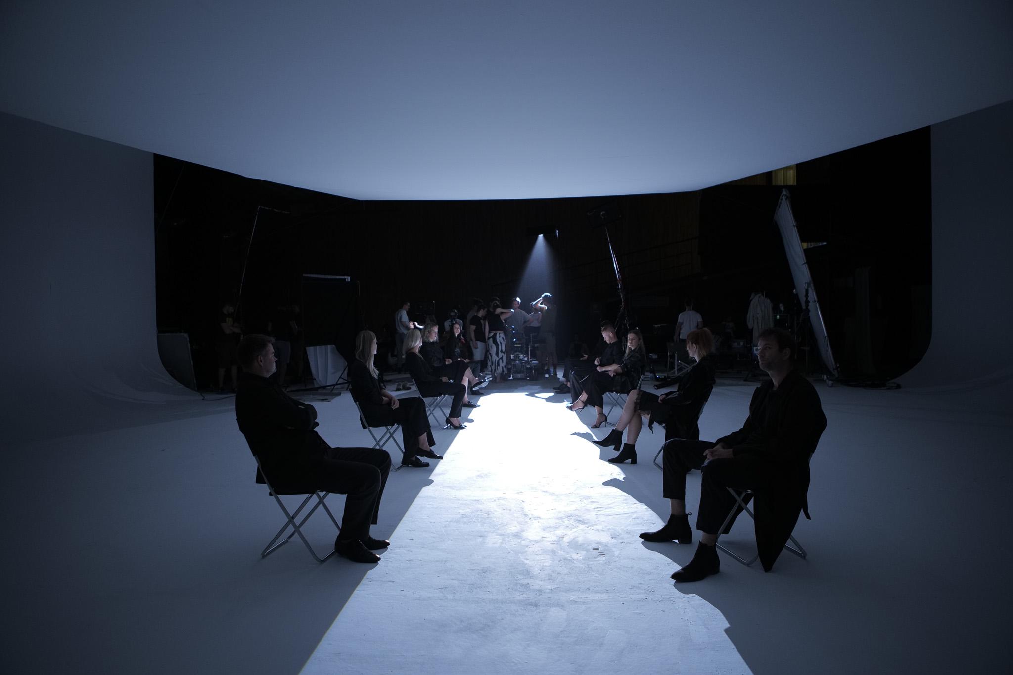
A key element was the set design, which resembled an art gallery—a space where the kitchen is presented as a piece of art. Each element in the video was carefully chosen to reflect the luxurious and minimalist design. The interiors and scenes create a strong visual contrast between modern technology and organic elements.

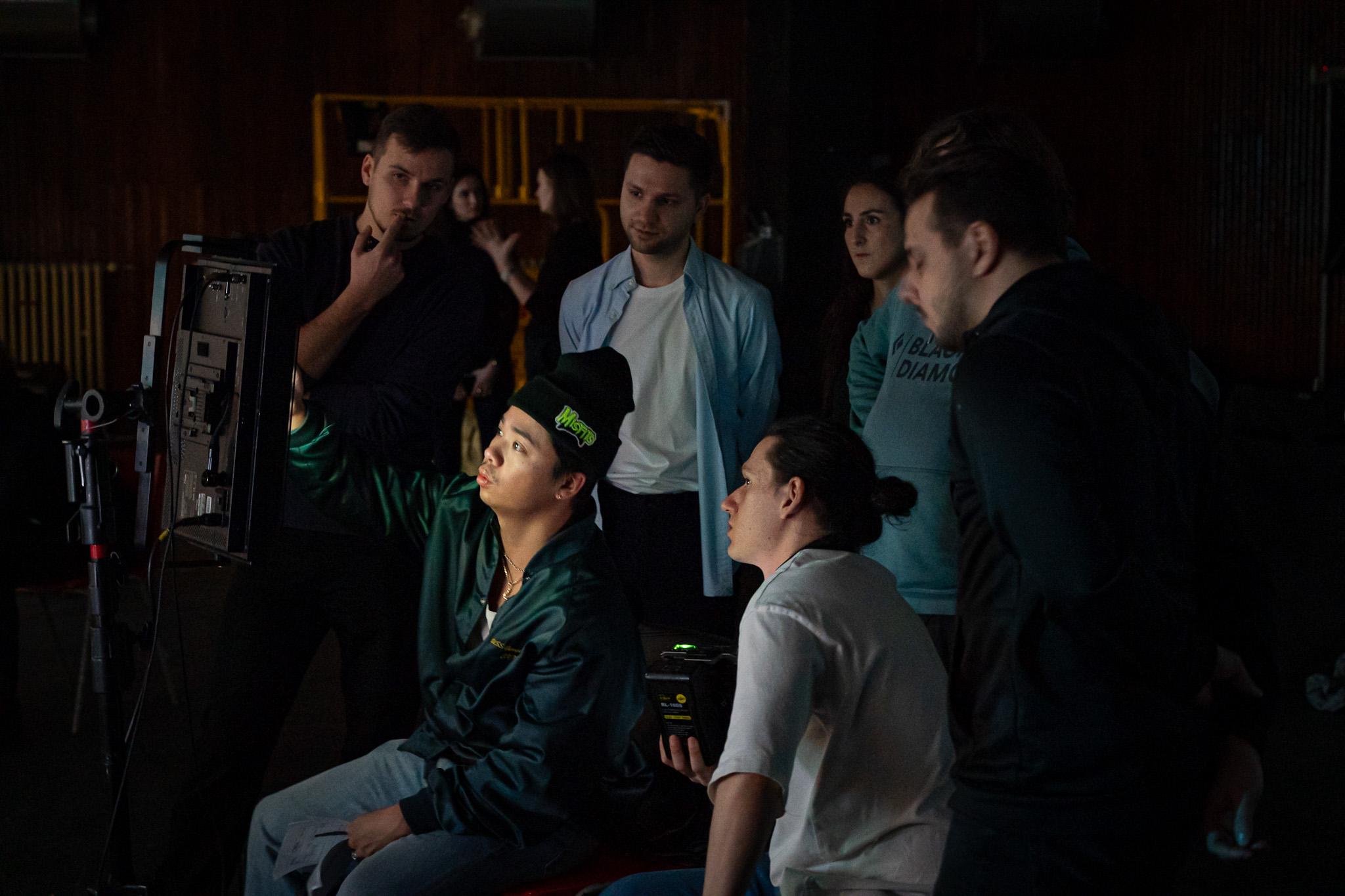
MakeUp mood in the director’s treatment phase for models representing the elements.
Color Palette – Color Grading
In creating the promotional video for ELEMENTS DESIGN, significant emphasis was placed on color grading, a crucial element of visual storytelling. The video’s color palette was carefully selected and adjusted to not only support the aesthetic look but also evoke the right emotions and highlight the luxurious nature of the brand. For this project, we chose to primarily use cooler colors for several reasons:
1. Luxurious Impression
Cool colors like blue, gray, and silver often convey sophistication and modernity, enhancing the luxurious appearance of ELEMENTS DESIGN kitchens. These tones contribute to a sense of cleanliness and elegance, desirable for high-quality design products. Cool colors also visually enhance the quality of materials such as stainless steel, glass, and modern composite materials, frequently used in luxury kitchens.
2. Contrast with Warm Tones
Many decorative elements and practical lighting have a warm light color. These orange and yellow tones play wonderfully in contrast with the primary cool color palette. This contrast helps highlight individual elements in the scene, increases depth of the image, and supports visual hierarchy.
We also utilized subtle emulation of 35mm film stock, combined with light grain, to create a more cinematic image.

Sound Design, Dynamic Editing, and Visual Effects (VFX)
For the ELEMENTS DESIGN project, it was crucial that the sound design perfectly complement the visual side of the video. Sounds of nature play a vital role in the overall atmosphere, with each of the natural elements supported by a specific sound motif. The use of striking sound design was also facilitated by dynamic editing to highlight the speed and fluidity of transitions between scenes, matching the rhythm and energy of the natural elements. The editing was simultaneously optimized for shorter video versions intended for social media.
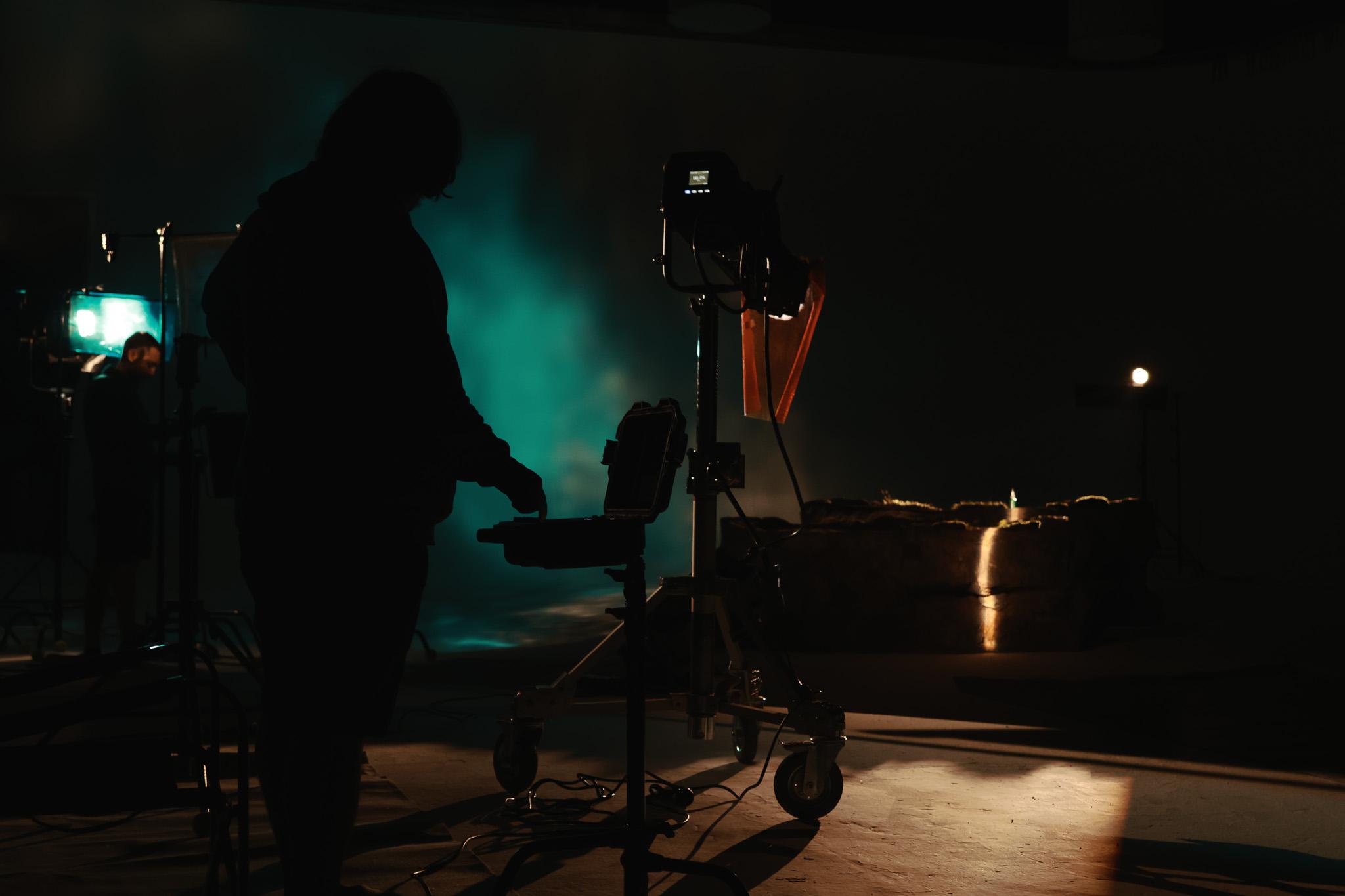
The final kitchen packshot was a key moment in the entire video. Installing the entire kitchen on location as envisioned was unrealistic. We therefore decided to utilize VFX and completely integrate the kitchen into the shot post-production.


DIRECTOR: MARTIN JANEŠ
DOP: JAN ŽŮREK
GAFFER: LUBOŠ MOŘICKÝ
BEST BOY: PROKOP STEINER
ELECTRICIAN: TIMOTEJ STURC
ELECTRICIAN: HASHIR RASHEED
PROPS: SURFPROPS
RUNNER: LUKÁŠ HYLSKÝ
COSTUMES: VERONIKA VARCHOLOVÁ
MUA: BARBORA LIPENSKÁ
SOUND DESIGN/MIX: LUKÁŠ PEŠEK
VFX: LUKÁŠ TEUBER & PETRA PLECHÁČOVÁ
CAST:
LUBOŠ JAKUBČÍK
NAMU AMARTUVSHIN
ELIZABETH JANKŮ
ESTHER LUBADIKA
BARBORA SMÍŠKOVÁ

Are you considering carrying out a similar project?
Let Ondra know
+420 723 801 250ondrej.repaty@unreal-visual.com
Or use our form and we will simply get back to you.

L'Oréal | BRIGHT REVEAL
Case Study
L’Oréal Paris decided to push the boundaries of the possible and introduce to the world an entirely new product – BRIGHT REVEAL. At Unreal Visual, we embarked on the production of an advertising spot aimed not only at introducing this innovative product but also at showcasing its immediate effect on the skin. Our targets were clear: to create something that would appeal to our target audience while also providing a unique visual experience.
BRIGHT REVEAL – In the Best Light
The main challenge was to present the BRIGHT REVEAL product in the best light – both literally and figuratively. We wanted to demonstrate that this product makes it possible to see an immediate change in the skin. At the same time, to create an advertising video that is fresh, modern, and different from previous campaigns.

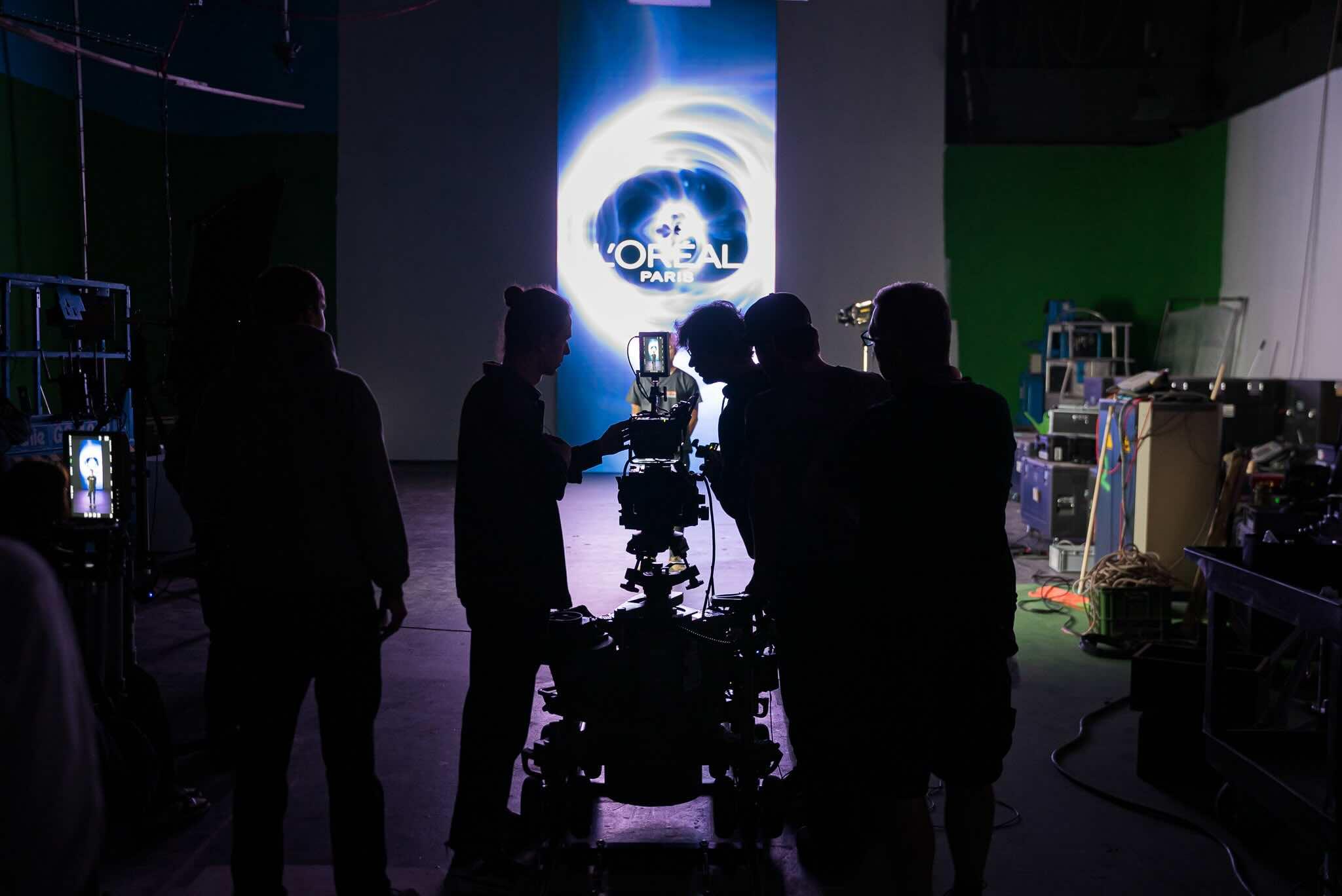
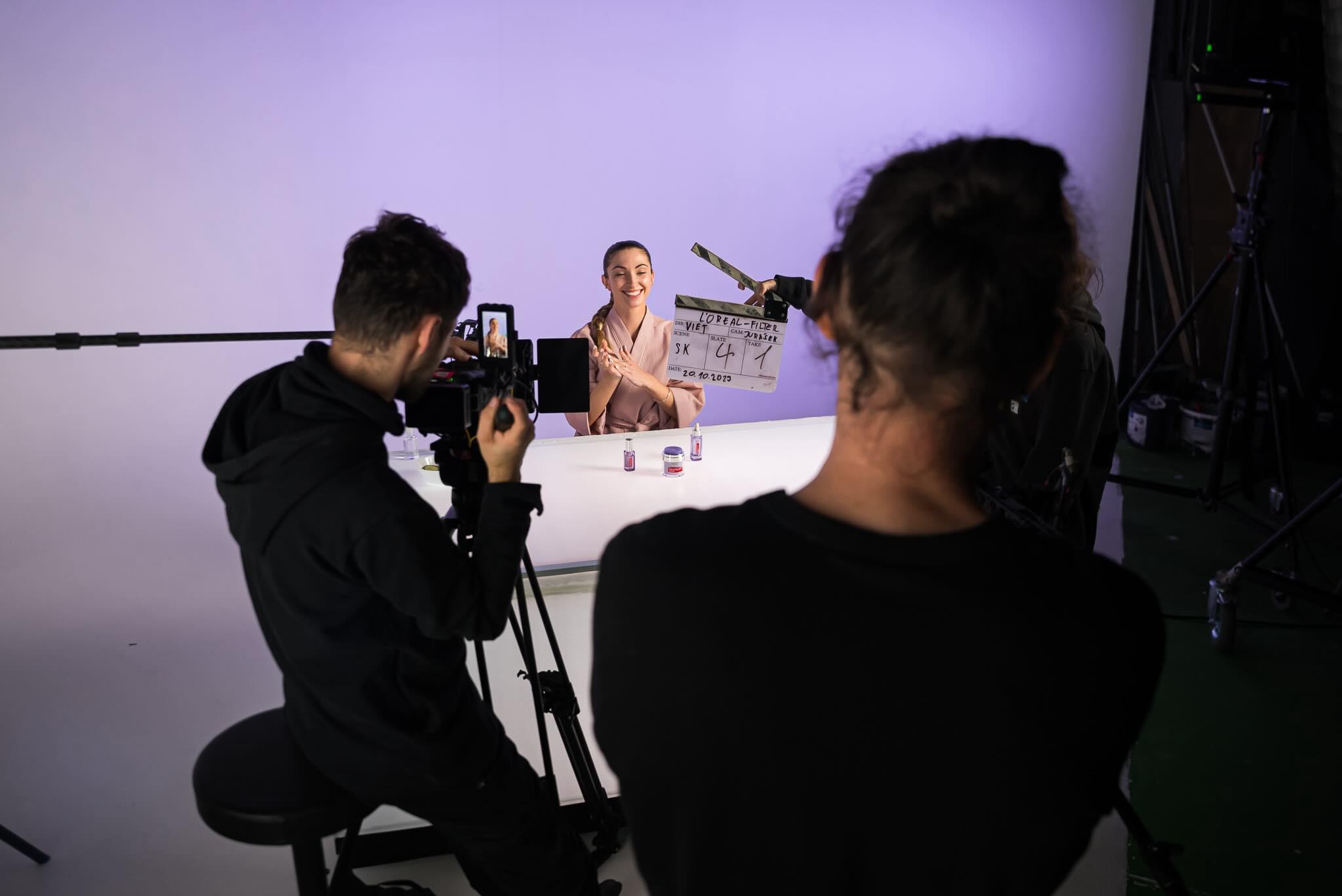
At Unreal Visual, we were responsible for creating the main spot, the trendy spot, and their shorter versions, in three language versions – Czech, Slovak, and Hungarian.
Main Commercial
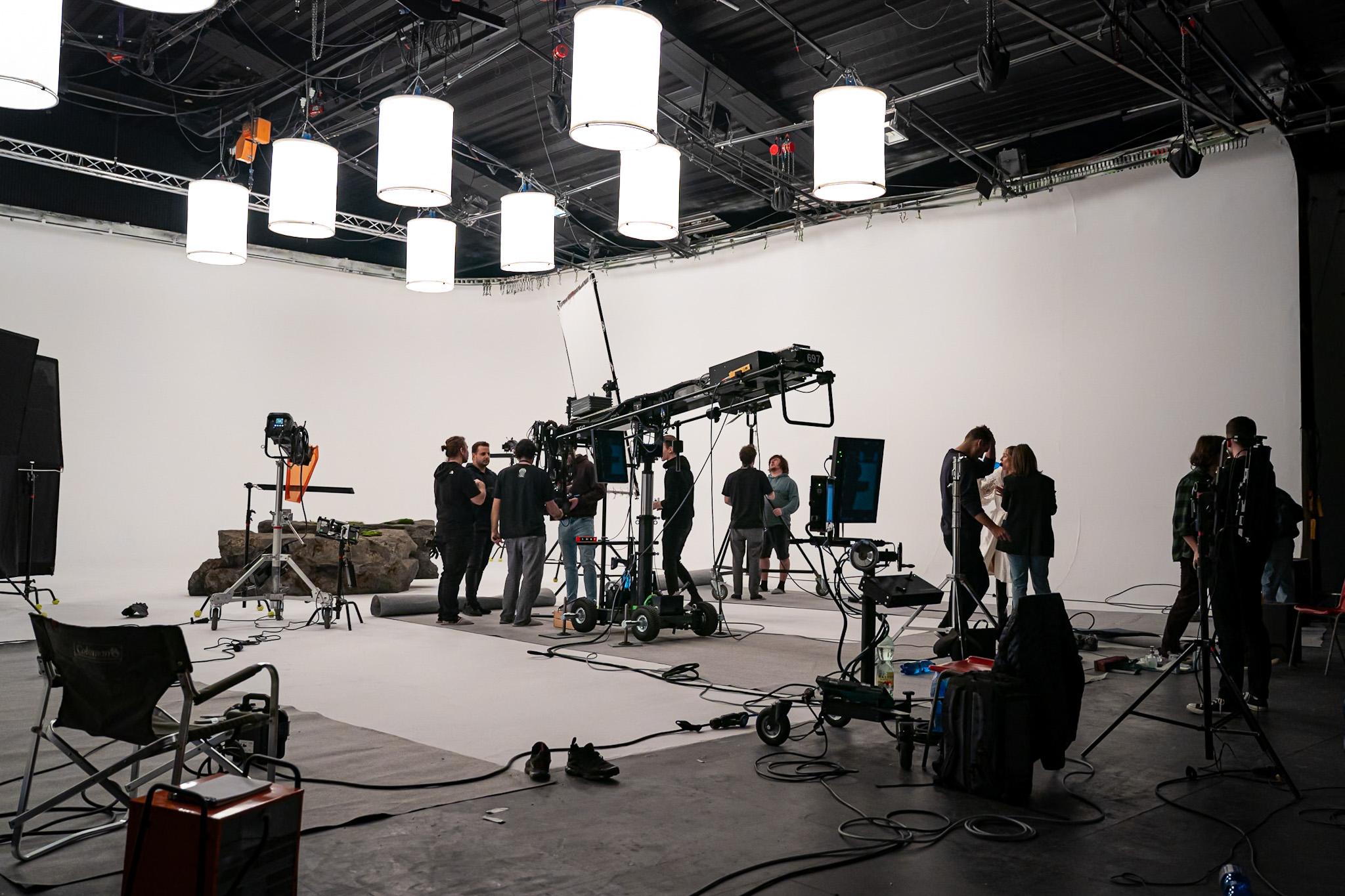
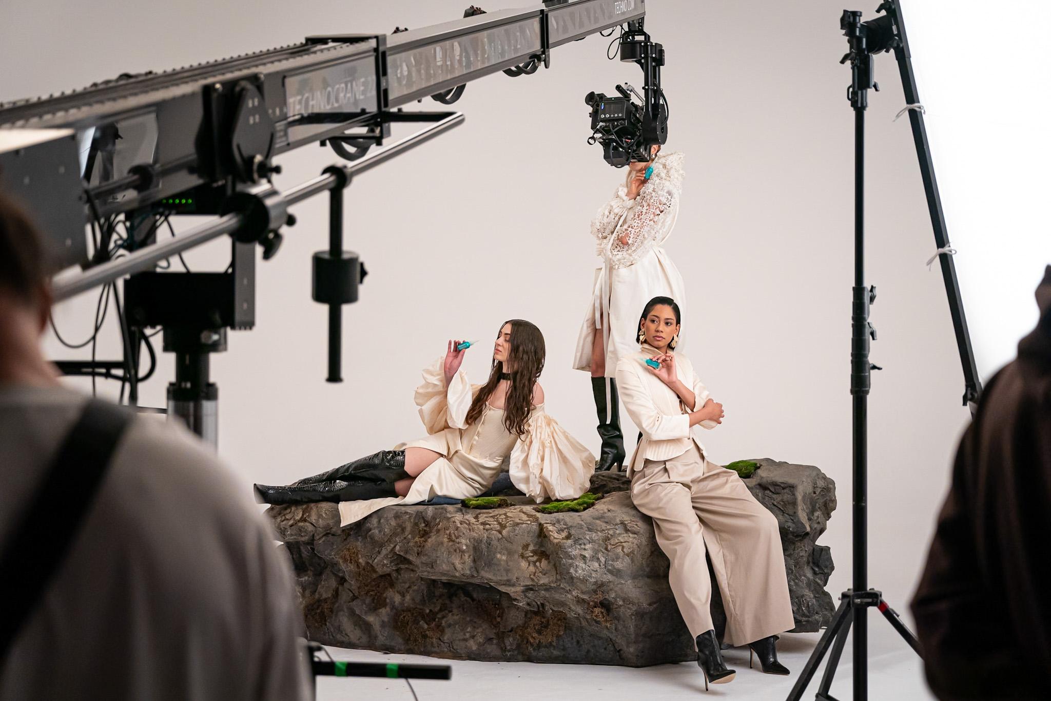
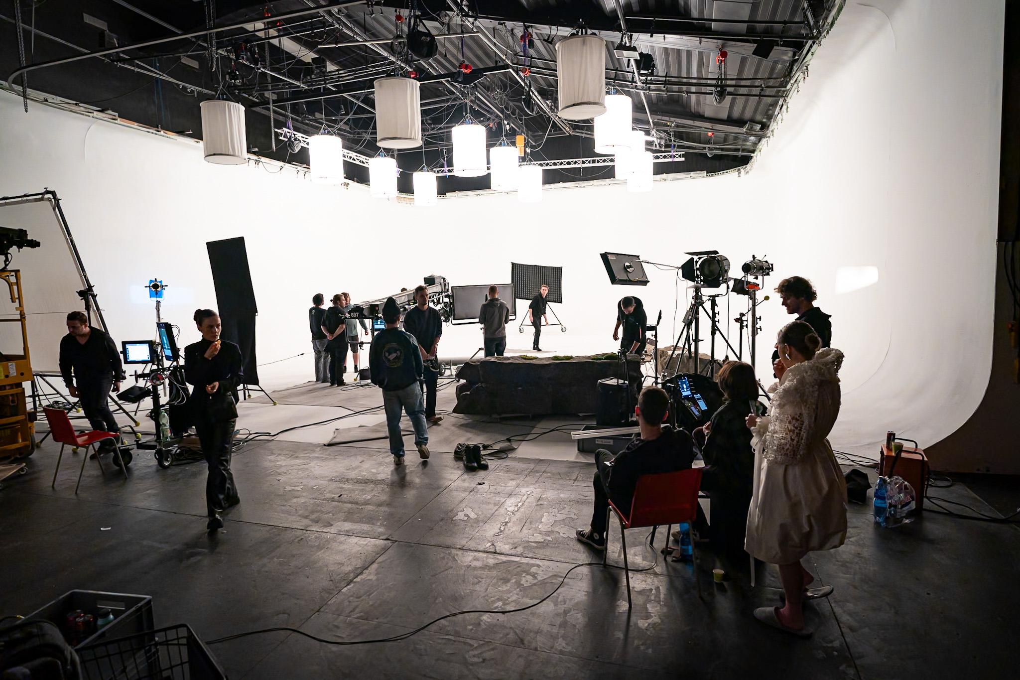
The creative approach included the use of three influencers, with whose help we wanted to introduce the product. We opted for a dynamic scenario that would draw the viewer into the story and show the transformation of the atmosphere from dark to light after applying the BRIGHT REVEAL product. A key element was visual storytelling, which combined innovative camera techniques, such as the use of a Technocrane for smooth and dynamic shots, with minimalist set design and stylish costumes.
The visual style was inspired by global campaigns and aimed to present the product as the key to a new, brighter world. Creating a contrast between the initial darker atmosphere and the bright, illuminated finale, which symbolized the product’s effect, was crucial.
Dynamic and Practical Guide
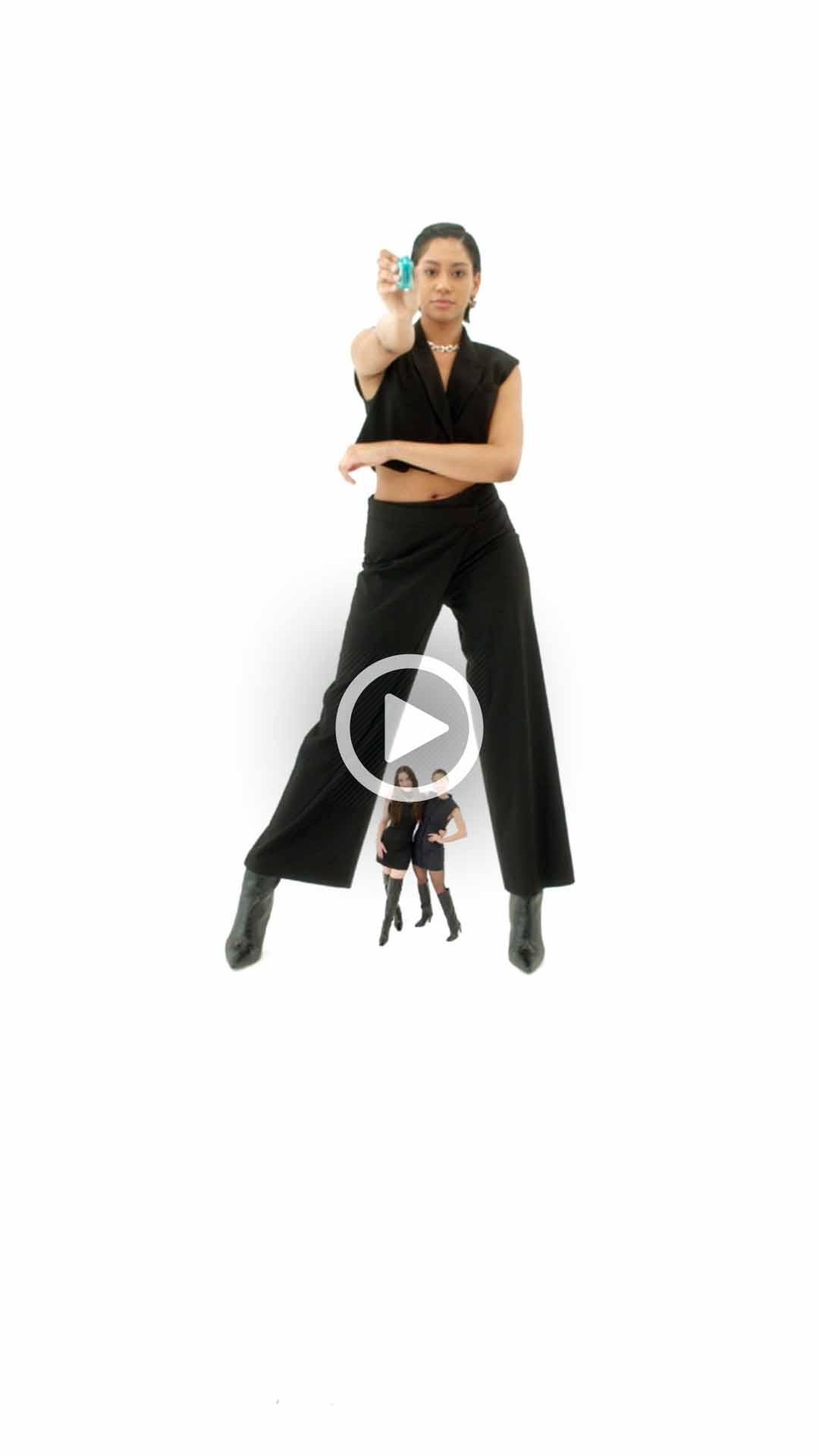
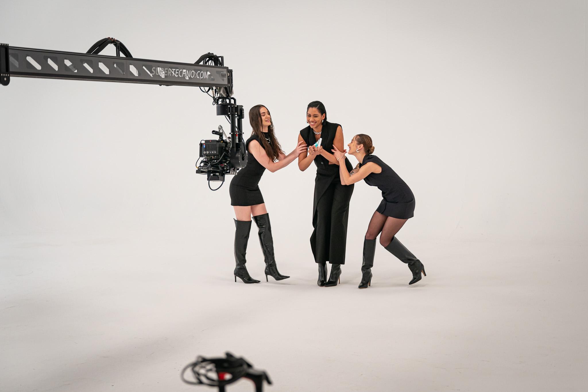
The TRENDY video serves not only as a visually engaging presentation but also as a practical guide, showing how to effectively use BRIGHT REVEAL products together to achieve the best possible result.
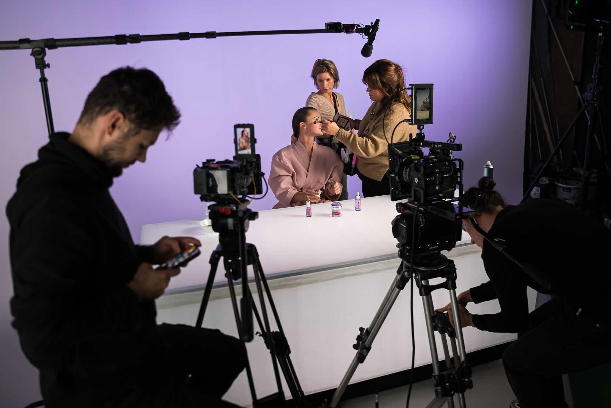
In an effort to stay true to the minimalist spirit of the entire campaign, the video was filmed against a purely white canvas, allowing all attention to focus on the products and their application. A short but dynamic sequence of clips highlights the ease of use and effectiveness of the products, adding a modern and trendy touch to the presentation that resonates with the target group of the L’Oréal Paris brand.
DIRECTOR: VIET DUONG
DOP: MICHAEL JURÁSEK
AD: MIKULÁŠ TUHÁČEK
1AC: ADAM KOVÁCS
2AC: JÁCHYM JIRÁŇ
PA: KATEŘINA HRDINOVÁ
GAFFER: LUBOŠ MOŘICKÝ
ELECTRICIAN: JAKUB HLINKA
BEST BOY: MARTIN FULÍN
DIT: TOMÁŠ HORÁK
PROPS: OTTO URBAN
TECHNO CRANE: KRU.SUPERTECHNO
COSTUMES: VERONIKA VARCHOLOVÁ
MUA: BARBORA LIPENSKÁ
HAIR: ANNA BADUN
GRADING: MICHAEL JURÁSEK
SOUND DESIGN/MIX: KAT.PRODUCTION
INFLUENCERS:
ANGELIKA TOKARSKA
KOUYATÉ HAWA KRISZTINA
ALEXANDRA SEDLÁČKOVÁ
Are you considering carrying out a similar project?
Let Ondra know
+420 723 801 250ondrej.repaty@unreal-visual.com
Or use our form and we will simply get back to you.

L'Oréal | REVITALIFT
Case Study
At Unreal Visual, we had the honor of collaborating with L’Oréal Paris on their Revitalift campaign. We bring you insight into this cooperation, which combines creativity and technical skills with L’Oréal’s innovative approach to marketing.
Three Types of Commercials
Our collaboration with L’Oréal involved creating three different types of video ads: Awareness video, ASMR video, and FILTR video. Each type was carefully designed to resonate with the young audience on TikTok and Instagram while faithfully representing the values of the L’Oréal brand.

Our task was to create three different types of video ads. All in three language versions – Czech, Slovak, and Hungarian. In addition, we also created ASMR audio tracks for Spotify.
Awareness
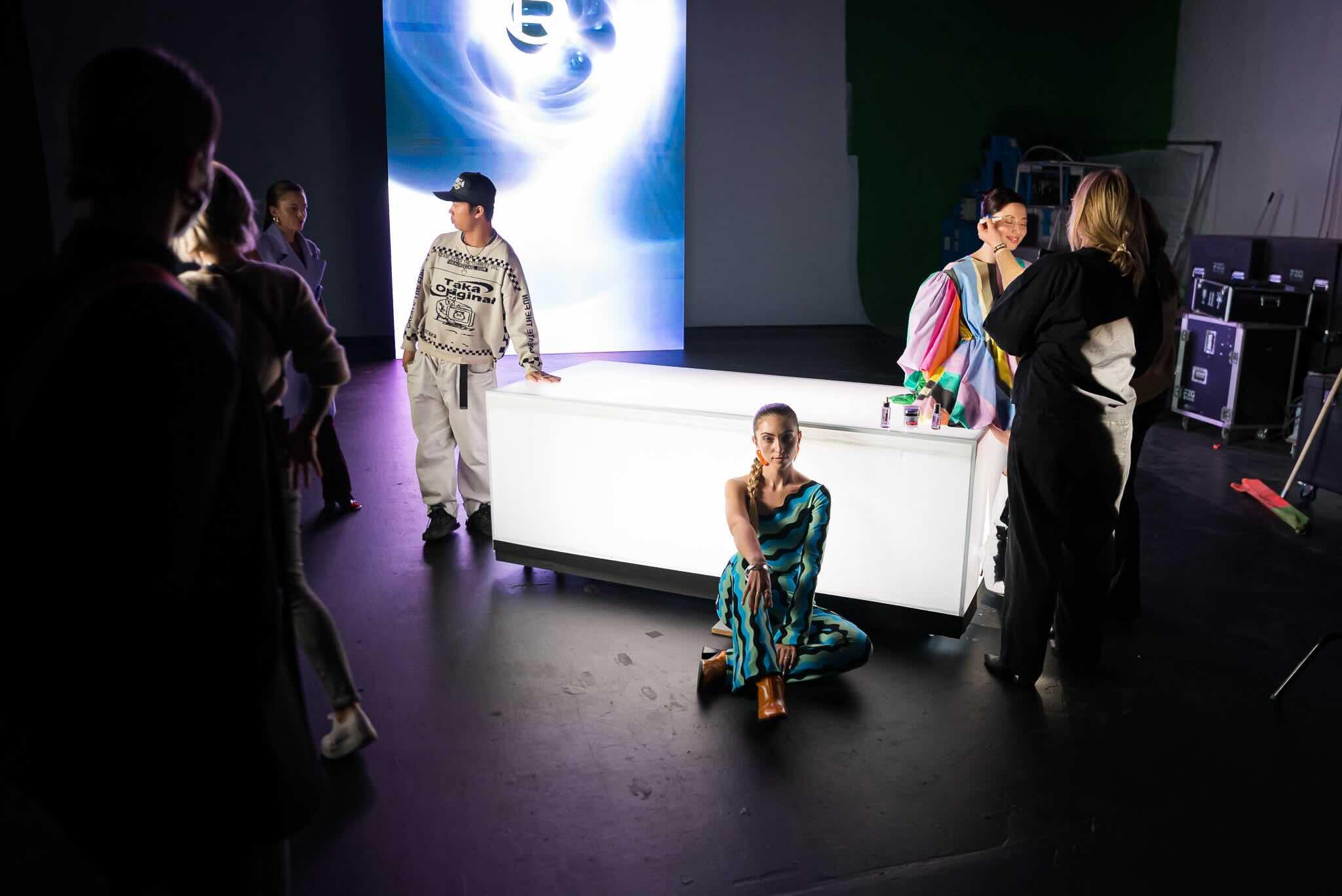
Our goal was to create a spot that captures and retains the attention of young viewers on TikTok and Instagram. We focused on dynamic product visualization, from quick detailed shots of the serums to the use of sophisticated LED walls to create an attractive and modern background. This combination brought freshness and energy to the ad.
The intention was for the set design to be minimalist yet impressive. We chose lights and LED walls that perfectly supported the products, while ensuring that every element of the set reflected the luxury and quality that L’Oréal Revitalift represents.
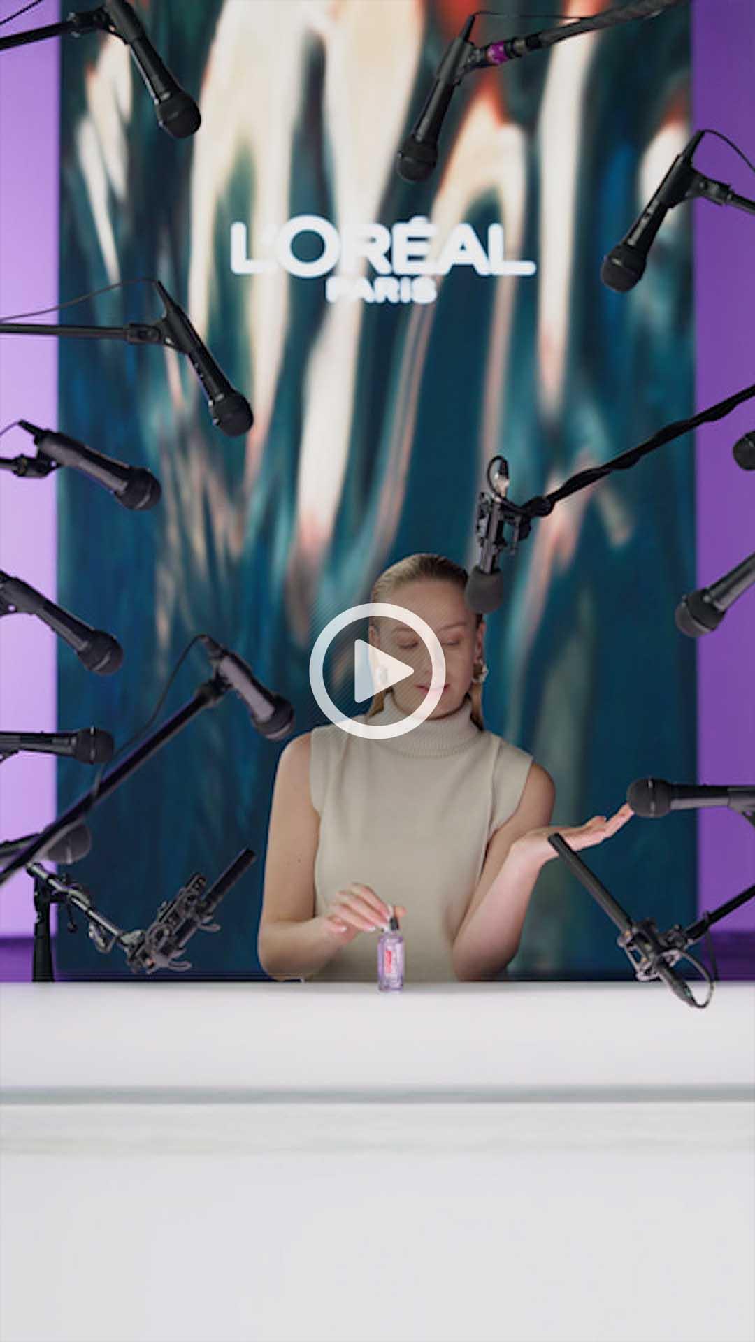
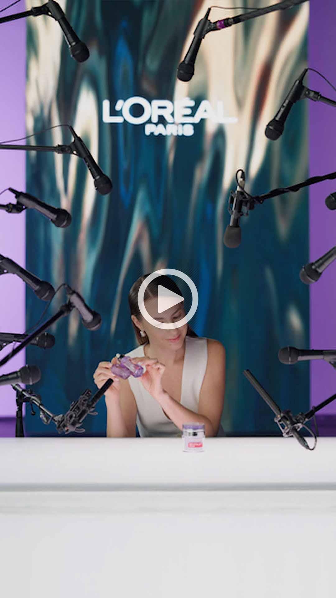
ASMR
ASMR (Autonomous Sensory Meridian Response) is a phenomenon characterized by a pleasant sensation of tingling or relaxation that people experience in response to certain visual or auditory stimuli. In advertising and video content, ASMR is becoming an increasingly popular tool, particularly for its ability to create a strong emotional connection with the viewer.
The ASMR spots were designed to provide an intimate and personal experience through the use of detailed sound effects and whispering. The goal was to strengthen the connection between the product and the viewer, create an emotional bond, and simultaneously inform about the product.
To visually support this concept, we completely surrounded influencers in the image with a large array of microphones capturing their whispers. We then created the ASMR versions of the spots in a pure audio form for Spotify.
Spotify CZE ASMR:
FILTR
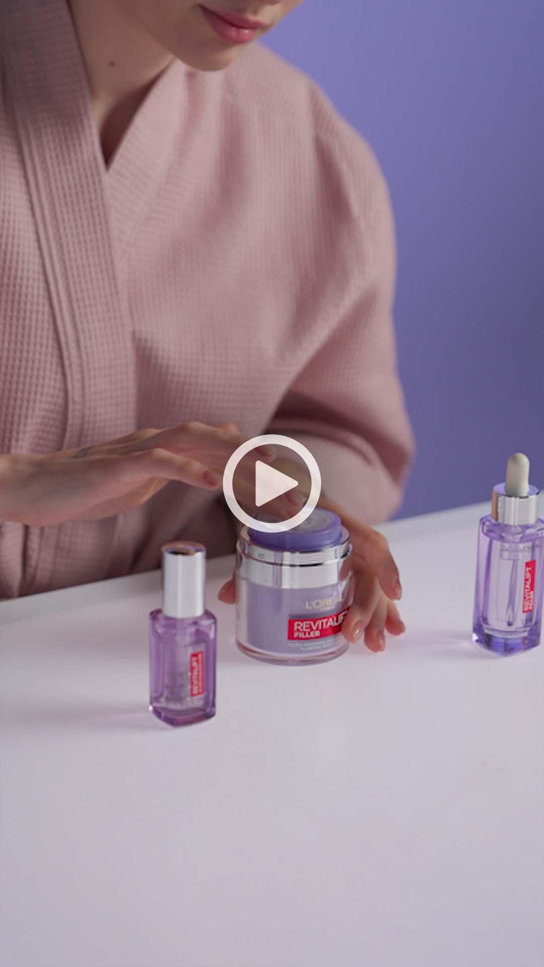
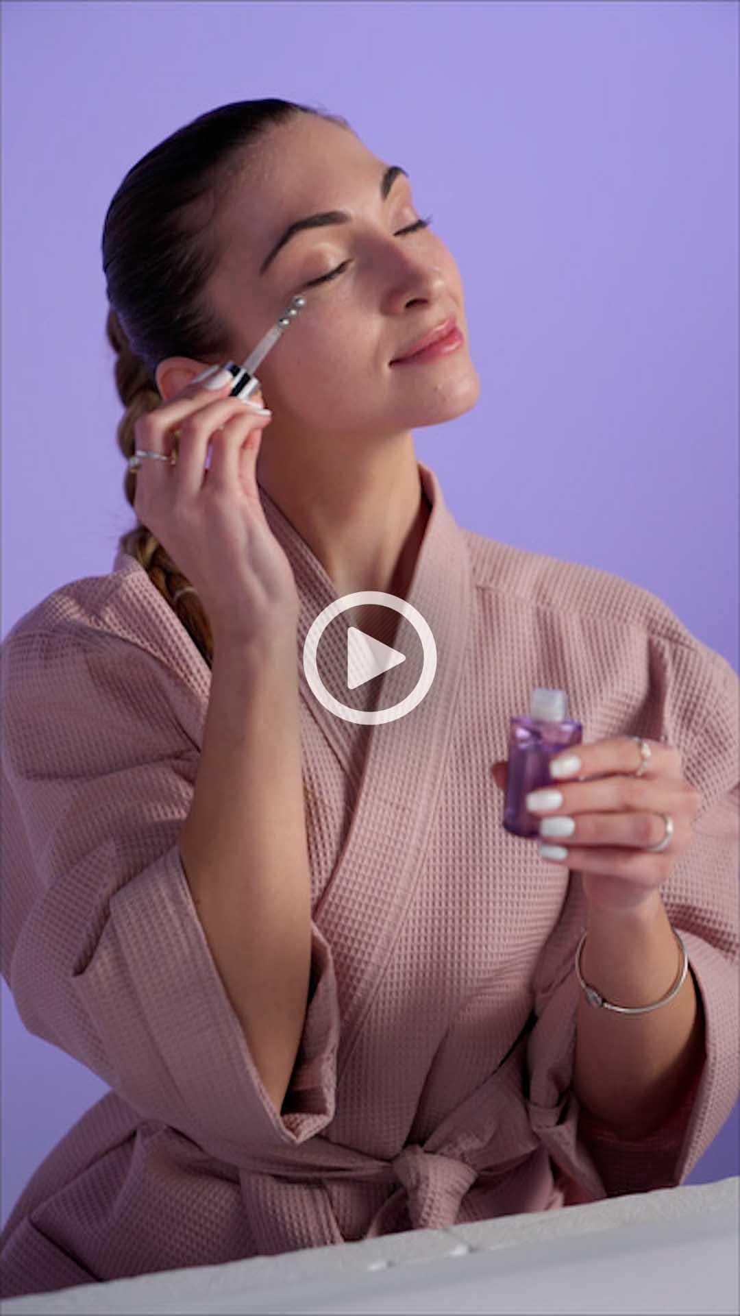
The concept of the FILTR commercials was designed with the idea of an influencer creating authentic content for her followers. The viewer witnesses the influencer applying L’Oreal Revitalift products while providing interesting information about them. During this, graphic titles appear on the screen, highlighting the key features of the products.
The spot begins with a shot of the Instagram interface, which the influencer then removes with a simple gesture, symbolizing the authenticity of her message – as if saying, ‘Filter? No, this is real.’ The entire video is processed in light tones with significant use of lavender color, matching our products.
At Unreal Visual, we are proud to have been part of a project that resonates with the younger generation. The L’Oréal Revitalift advertisement brings a refreshing approach to marketing targeted at the young. With a combination of dynamic visual style, influencer marketing, and ASMR, this campaign effectively communicates the values and properties of the products while respecting modern trends and preferences of the young audience.
DIRECTOR: VIET DUONG
DOP: MICHAEL JURÁSEK
AD: MIKULÁŠ TUHÁČEK
1AC: JAKUB VEINLICH
2AC: TEREZA VEINLICHOVÁ
GRIP: VOJTĚCH ŠPULÁK
PA: KATEŘINA HRDINOVÁ
GAFFER: LUBOŠ MOŘICKÝ
ELECTRICIAN: JAKUB HLINKA
BEST BOY: MARTIN FULÍN
DIT & VIDEO OPERATOR: TOMÁŠ KAPINUS
COSTUMES: VERONIKA VARCHOLOVÁ
MUA: RENATA ZELINKOVÁ
MUA: KATEŘINA ŠULCOVÁ
HAIR: ŠTĚPÁNKA VELÍŠKOVÁ
EDIT: VIET DUONG
GRADING: MICHAEL JURÁSEK
SOUND DESIGN/MIX: LUKÁŠ PEŠEK
INFLUENCERS:
ANNA MARIE PURIĆ
BARBORA HAZUCHOVÁ
PAP DORKA
Are you considering carrying out a similar project?
Let Ondra know
+420 723 801 250ondrej.repaty@unreal-visual.com
Or use our form and we will simply get back to you.
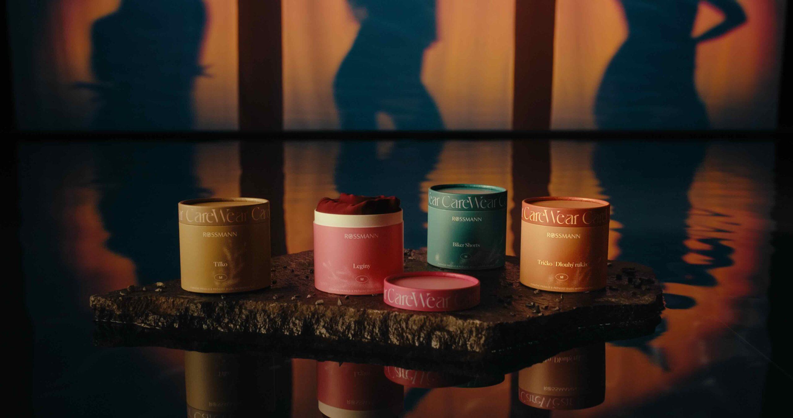
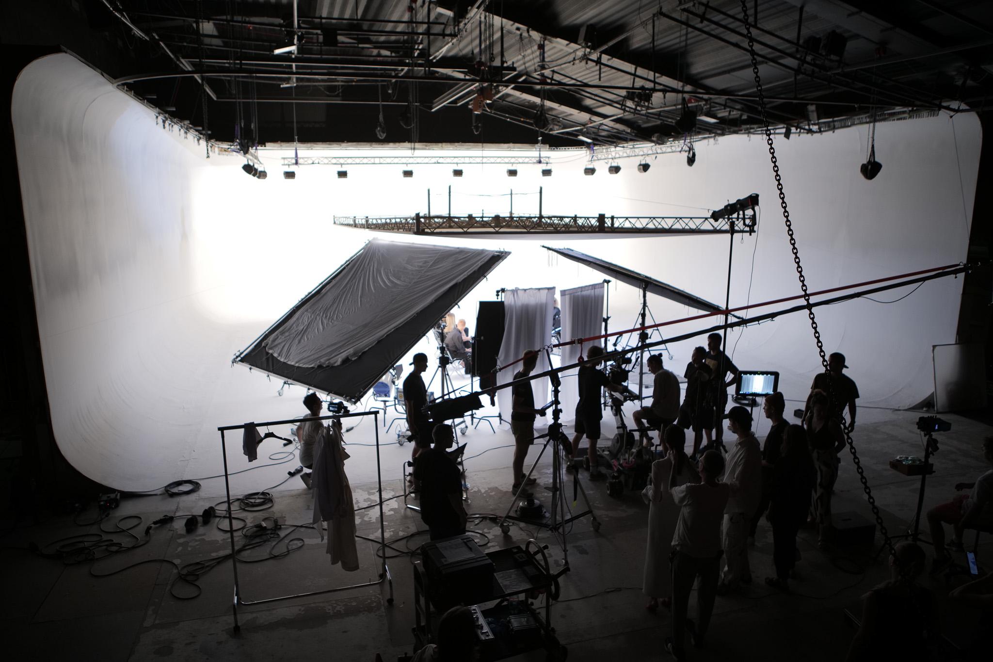
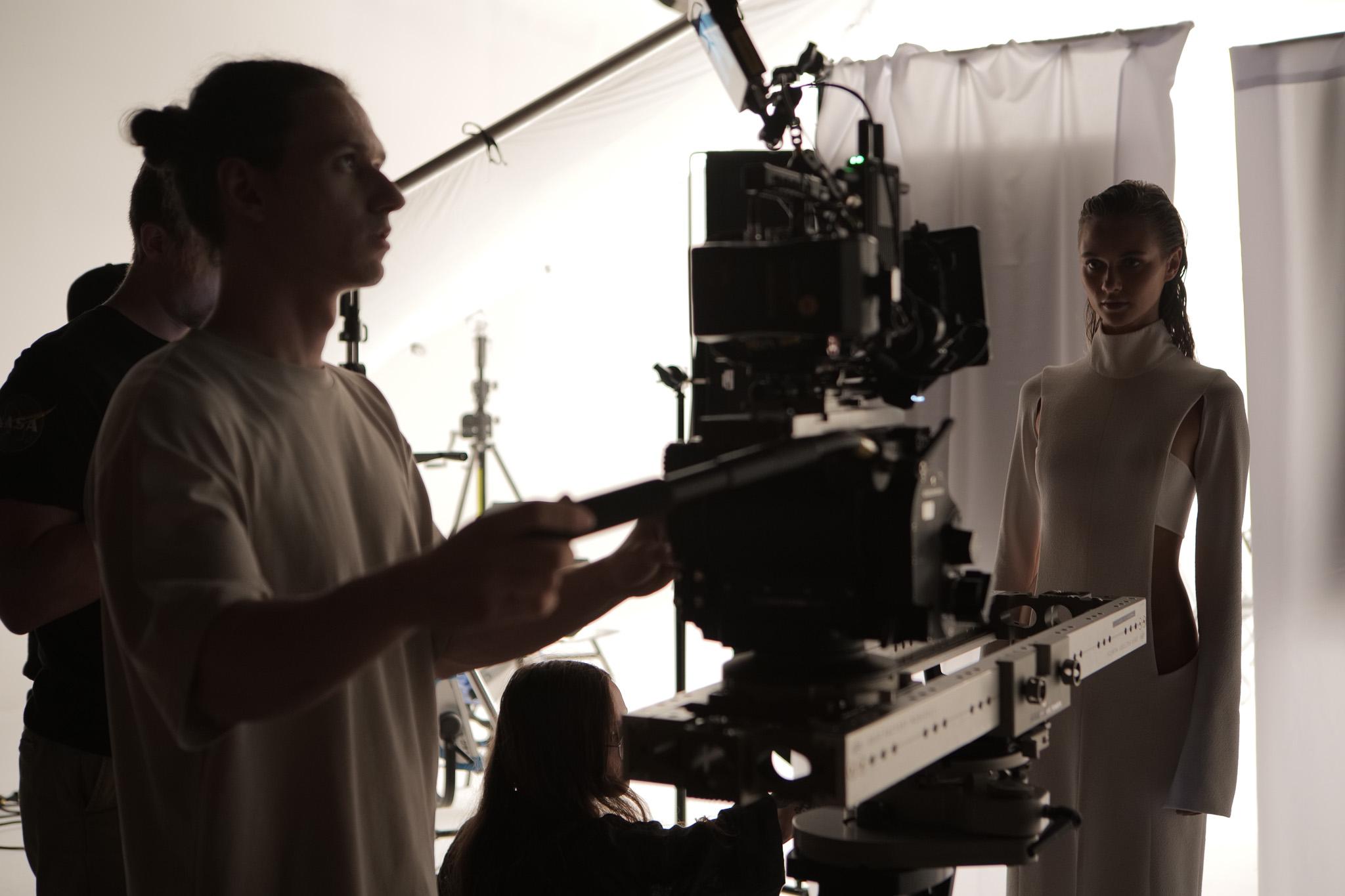
ROSSMANN | CAREWEAR
Case Study
In Unreal Visual, we were delighted to accept the challenge from DDB Prague agency and transformed their brief into a creative and visually stunning campaign for ROSSMANN CAREWEAR.
The brief from DDB Prague agency was comprehensive and detailed, providing us with a clear framework and expectations for the project. Our goal was to create a video and key visuals that not only met the agency’s specifications but also exceeded expectations and pushed the boundaries of traditional marketing.
Our task was to create a total of five versions of the video (6s, 15s, 30s, 60s, and a vertical 15s format). In addition to the commercials, we created four key visuals.
Process of Creating the Creative Design
The first step was a thorough analysis of the brief from the agency. From the brief, we gathered key information about the target audience, communication style, advertisement spot concept, and the main values of the ROSSMANN CAREWEAR brand. With these insights, we approached the development of our creative design, which was not only to meet the brief but also to bring new, fresh energy into the project.
Creative Design
Water, seaweed, fashion, sensuality, skin, and contrast. These words served as a guide throughout the project and inspired us to create a unique visual style.
Nature, represented mainly by water and sunbeams, is the centerpiece of the entire creative design. We don’t pretend to be at a real location – why hide something that is obvious and not instead turn it into an advantage that we are filming in a movie studio?
Things like a white background and artificial sun projected on it, or our own piece of “sea,” albeit only a few square meters in size, create a striking contrast to natural elements.
Realization
For filming and photography, we created a main set in the studio, consisting of an artificial pool filled with water and complemented by other props. The white background allowed us to create light projections reflected directly from the water’s surface.

Actors, Makeup, and Styling
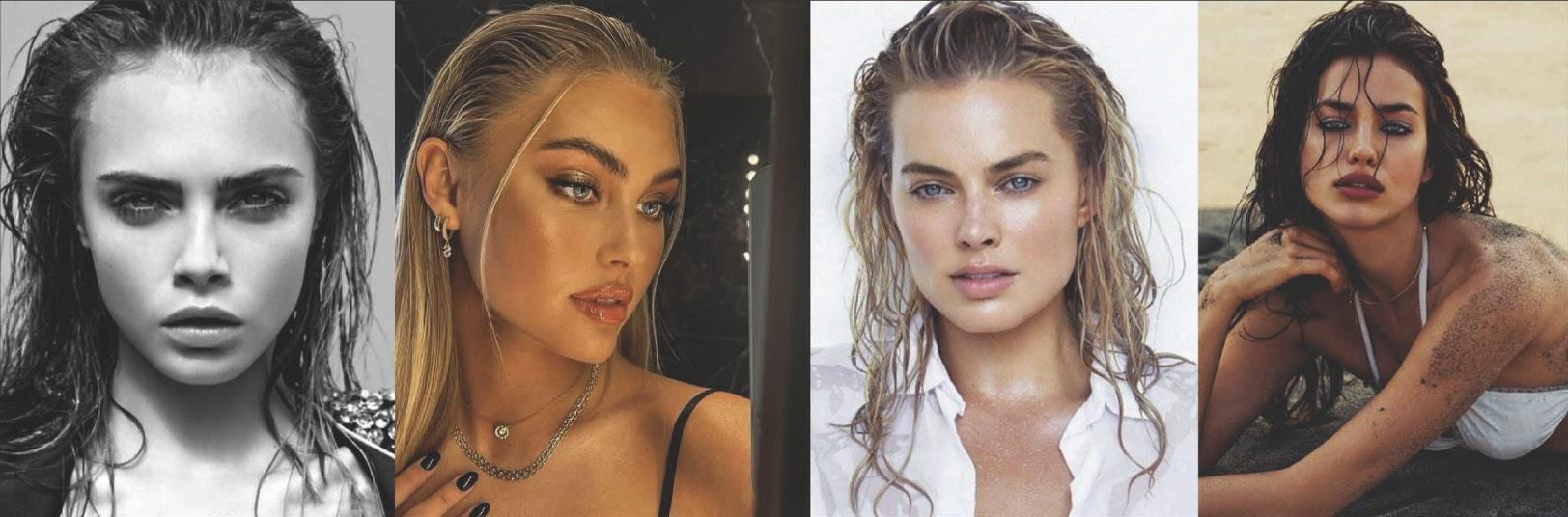
The selection of actors was crucial. We focused on diversity to ensure our content resonated with a broad spectrum of viewers. Makeup and hairstyles were designed to support the connection with the brand and nature, emphasizing a natural yet ostentatious look. The “wet look” perfectly complemented the overall visual of our spot.
Cinematography and Lighting
We divided the entire spot into two parts. The first – more mysterious, allowed us to use softer lighting. Camera movements are also longer and dreamier. During this phase, using a voiceover, we explain the message to the viewer and keep them in suspense.
In the second phase, we answer the viewer’s questions and dispel the veil of mystery. The second part of the spot starts with a change in lighting atmosphere – symbolized by the sunrise. Contrasting sunbeams fill the studio. The editing, camera movements, and sound design become more intense. The spot is more energetic, ensuring we keep the viewer’s attention until the very end of the spot – the sunset with a packshot of the ROSSMANN CAREWEAR products.
The ROSSMANN CAREWEAR project was a great opportunity for us to demonstrate our ability to transform a creative vision into reality.
AGENCY: DDB PRAGUE
DIRECTOR: MARTIN JANEŠ
DOP: MICHAEL JURÁSEK
AD: MIKULÁŠ TUHÁČEK
1AC: JAKUB VEINLICH
GAFFER: LUBOŠ MOŘICKÝ
2AC: ŠIMON KŘÍŽ
BEST BOY: MARTIN FULÍN
SET DESIGN: ALEX KUREL
PROP MASTER: FRANTIŠEK ŘEZNÍK
COSTUMES: LIZ OVCHACHENKO
MUA: BARBORA LIPENSKÁ
PHOTOGRAPH: MARYNA VELKYNETES
MODELS:
MAGDALENA KOŘENOVÁ
TRANG DO THU
TEREZA SCHERTLEROVÁ
Are you considering carrying out a similar project?
Let Ondra know
+420 723 801 250ondrej.repaty@unreal-visual.com
Or use our form and we will simply get back to you.

Komerční banka | PURE
Case Study
Transforming CO2 into Art
At Unreal Visual, we enthusiastically embarked on the KB PURE project, representing a synergy between innovations in sustainability and fashion. This was in partnership with Komerční banka and the advertising agency DDB Prague.
Advertising Campaign by DDB Prague
Through this campaign, Komerční banka positions itself as an innovator in the field of carbon neutrality. This vision is embodied in the effort to transform CO2 into useful products, such as payment cards and fashionable clothing.
Our task was to create a 60-second main spot, a 30-second shorter version, and to shoot additional footage for use in TV commercials. Additionally, we created several shorter formats for use on other platforms.
PURE Fashion Collection and LanzaTech Technology
In collaboration with the design studio LAFORMELA, the PURE collection was created, made from recycled CO2 transformed into textile material using LanzaTech technology. The collection was presented as a symbol of innovation and the desire for a carbon-neutral world.
The Role of Unreal Visual in the Project
Our role in this project was to create a visually striking video that would present this unique campaign. Key elements were fashion, purity, and minimalism, embodied in every shot.

One of the most striking features of the video was a digitally created payment card.
Script and Voiceover
The video script was carefully designed to convey the message of the campaign, using the metaphorical transition from light, airy smoke to a materialized payment card and finally to fashionable clothing. The voiceover plays a key role. Voiceover guiding viewers through the entire story. From the idea of reducing atmospheric CO2 to its transformation into useful products.
The KB PURE project demonstrates how advertising can be a tool for conveying important messages about sustainability and innovation. We are proud to have been part of this initiative, and that our work contributed to the shift towards a carbon-neutral future.
AGENCY: DDB PRAGUE
DIRECTOR: MARTIN JANEŠ
DOP: MICHAEL JURÁSEK
PRODUCER: ADAM BĚLÍK
AD: MIKULÁŠ TUHÁČEK
1AC: JAKUB VEINLICH
2AC: PETR HAŠEK
GAFFER: MARTIN FULÍN
BEST BOY: MAREK VOPIČKA
COSTUMES: KLÁRA MACKOVÁ
MUA: ESTER TESAŘÍKOVÁ
RUNNER: TOMÁŠ HUBÁČEK
KEY GRIP: LUKÁŠ HAVELKA
HAIR: ROBIN BILKA
PROP MASTER: FRANTIŠEK ŘEZNÍK
VFX: NOTREAL
MODELS:
AMANDA DIAZ
ANNA SVIRIDOVÁ
JURAJ SABO
Are you considering carrying out a similar project?
Let Ondra know
+420 723 801 250ondrej.repaty@unreal-visual.com
Or use our form and we will simply get back to you.

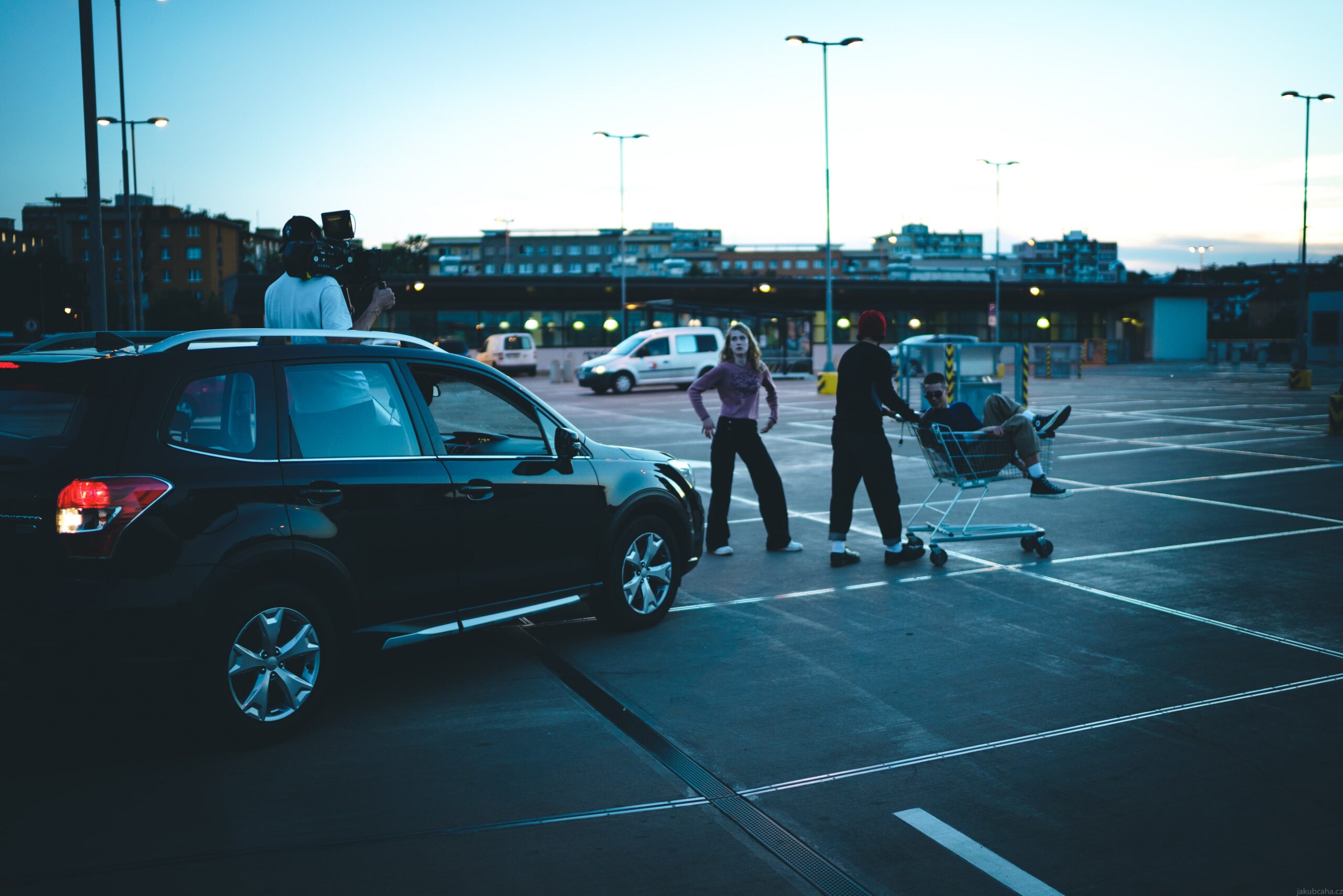
VODAFONE YOUTH
Case Study
How we created commercials for VODAFONE in collaboration with McCann Prague
Our task was to create a series of commercials that appeal to the young target audience and demonstrate that being oneself, with all our quirks, is the best thing we can do. The key message was to support individuality and originality.
“Being Yourself”
Our main goal was to create content that is honest, authentic, and resonates with young people. We decided on the concept of “observational spots,” where we became observers of everyday, yet unusual situations that young people experience. Each spot was designed to tell a story that, despite its simplicity, is emotionally charged and true to life.
Visuals, Emotion, Hook
Observational spots based on situations or emotions have a wonderful charm. But since we operate in the relentless world of online, it was necessary to start the spots with something that captures attention. We opted for a combination of macro shots and detailed shots using light changes that reflect the emotional states of the characters. For example, a shot of an eye or a finger on a phone as an initial “hook” precedes the main part of the story.
Sound and Music
Sound plays a key role in our storytelling. We decided to use sound design that expands the reality of the characters, and music that supports the emotional changes the characters experience. For instance, the use of muted sounds in tense moments and their return to normal when the characters feel better.

“Neomezeně cringe” VODAFONE YOUTH
This project was not only a challenge for us but also an opportunity to demonstrate our ability to transform creative ideas into effective commercials. We believe that our work will help strengthen the relationship between the Vodafone brand and the young generation and support their desire to be themselves.
AGENCY: MCCANN PRAGUE
DIRECTOR: NOVAK+NGUYEN
DOP: DUŽAN DUONG
CAMERA OPERATOR: MATEJ HOLLY
1AC: JIRKA WOJTA
GAFFER: RICHARD BEZDĚKA
MUA: MARTINA LOY
PRODUCER: ADAM BĚLÍK
PA: ESTER ČERMÁKOVÁ
SOUND DESIGN/MIX: LUKÁŠ PEŠEK
EDIT: VIET DUONG
GRADING: ENTHONY GRAIN
Are you considering carrying out a similar project?
Let Ondra know
+420 723 801 250ondrej.repaty@unreal-visual.com
Or use our form and we will simply get back to you.

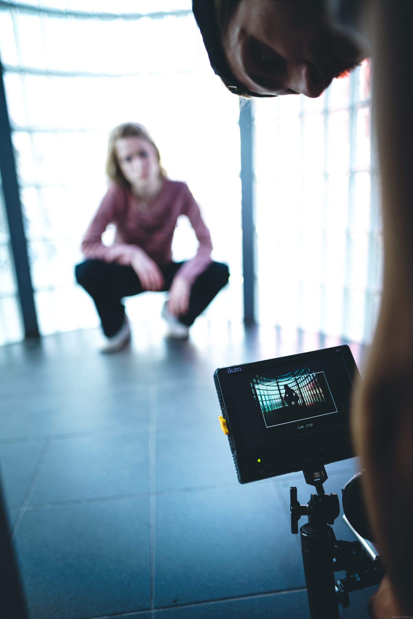
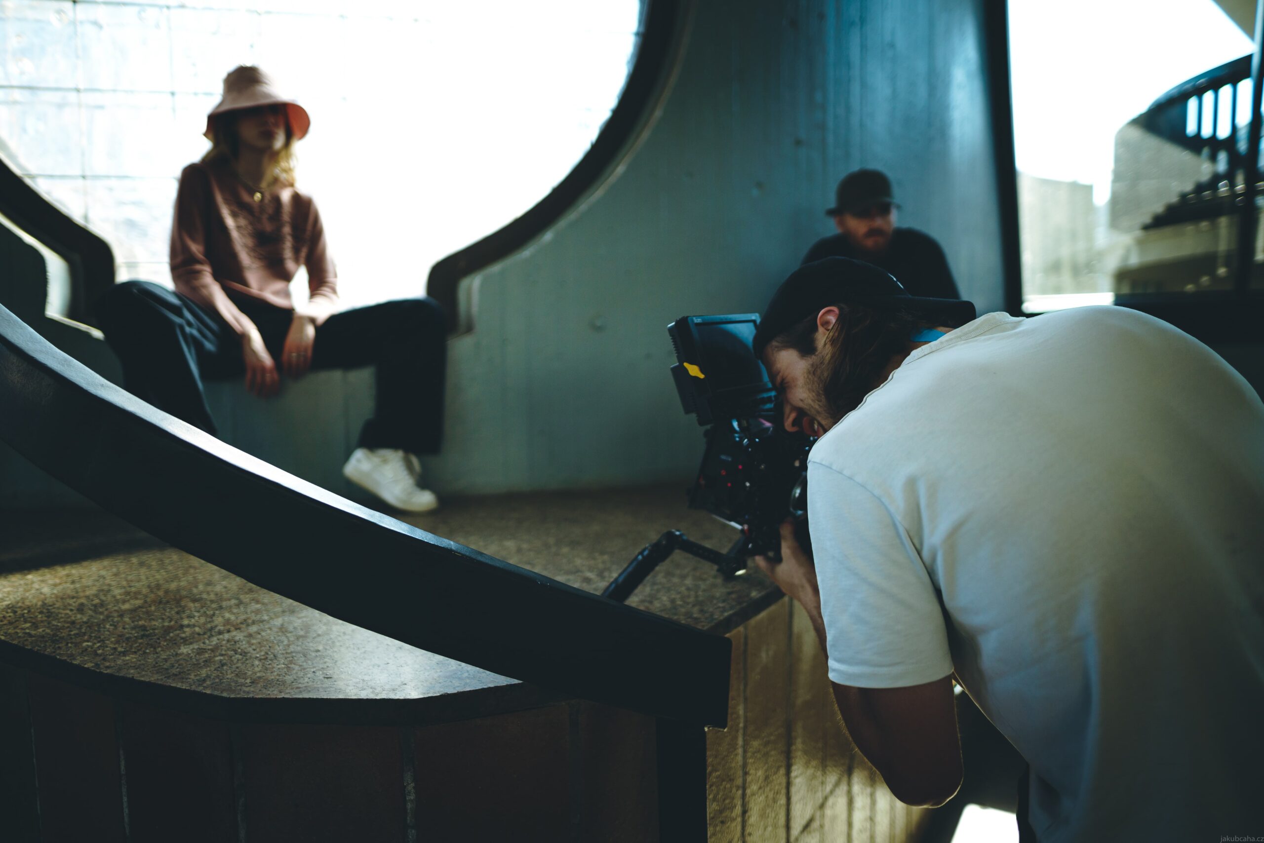
ČEZ
Case Study
At a time when people are grappling with financial challenges and rising energy prices, ČEZ, in collaboration with the advertising agency McCann Prague, launches a campaign that offers concrete solutions and support.
This campaign, building on the concept of “positive energy”, focuses on three key areas: Self-reading, specialists at Czech Post, and a counseling service during financial hardship.
The task for our production at Unreal Visual was, based on the materials and script provided by the agency, to create three spots for each key area, targeted at three different audience groups.
The spot “Self-reading” dedicated to the theme: Energy under control
Our creative vision
We were excited about the idea of simple, minimalist spots where the camera becomes a kind of probe into the lives of our characters. We wanted everything to feel as real as possible. The basic concept was therefore uniform for all spots.
In the first phase, we introduce our characters through fragments in their living space. This part is also complemented by the inner voice of our character, which serves as an emotional starter, making us further interested in the character itself. For example: “What I mainly needed to find out was how long my price is valid for and how it works with the capping.”
The spot “Post” dedicated to the theme: Specialists at Czech Post.
In the next phase of the spot, we introduce our character in their normal activity. An activity where we see how well they are doing. How full of hope and gratitude they are. We add direct speech, for example: “The counseling service during financial hardship, recommended by ČEZ, helped spread out the payments until our situation improves.”
We conclude the spot with a departure from the window, through which we see our character in a broader context. We liked the premise of the window acting as a connector between the inner and outer worlds. The longer departure also gives the viewer a greater chance to process the emotions gathered during the spot. First, we follow our characters through details and end with the context in which they live.
The spot “Counseling” dedicated to the theme: Counseling service during financial hardship.
Each spot was designed to communicate specific ways ČEZ helps its customers, while also showing that the company is there for them in good times and bad. Through this approach, each spot contributes to a better perception of the ČEZ brand, demonstrating that “positive energy” is more than just a slogan – it’s a commitment.
AGENCY: MCCANN PRAGUE
DIRECTOR: NOVAK+NGUYEN
DOP: TOMÁŠ UHLÍK
AD: ŠTĚPÁN UŽDIL
1AC: MICHAL MACHULDA
2AC: MARTIN PROCHÁZKA
GAFFER: VÍT MORAWSKI
BEST BOY: MATĚJ OUJEZDSKÝ
2ND BEST BOY: TOMÁŠ TESAŘ
SOUND: PAVEL VRTĚL
WARDROBE: KLÁRA MACKOVÁ
MUA: ŠTĚPÁNKA VELÍŠKOVÁ
PROPS: SURF PROPS MARTIN ROTT
PRODUCER: ADAM BĚLÍK
PA: ESTER ČERMÁKOVÁ
SOUND DESIGN/MIX: LUKÁŠ PEŠEK
GRADING: TOMÁŠ UHLÍK
EDIT: TOMÁŠ BLÁHA
Are you considering carrying out a similar project?
Let Ondra know
+420 723 801 250ondrej.repaty@unreal-visual.com
Or use our form and we will simply get back to you.

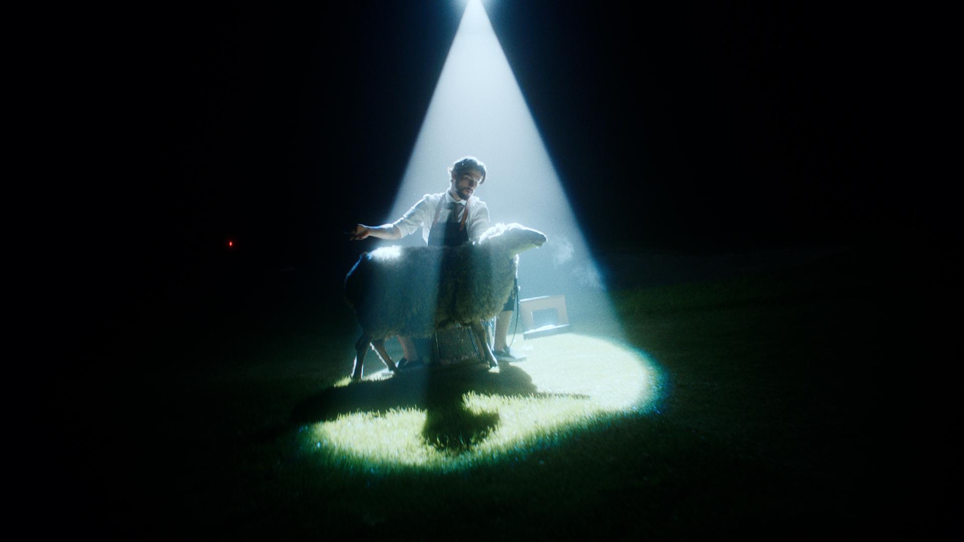
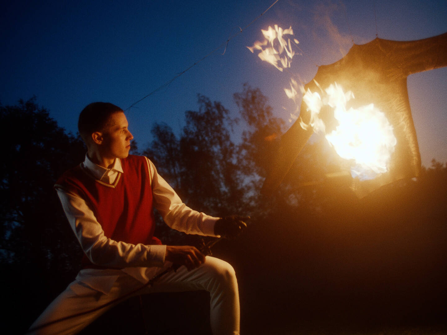
Livesweaters
Livesweaters
16mm film, levitating ball, golf carts, sheep or a ring of fire. All this in a promotional branded video that we created for the fashion brand Livesweaters.

Assignment
Creating an advertising branded video that aims to emphasize the uniqueness and originality of the products in a modern and original way. Personalizing the “Be The Show” brand claim and promoting a new premium collection of products aimed at golfers.
Implementation
We try to metaphorize the “Be The Show” brand claim in the spot. Meaning break the rules and be an individual who does not let trends and conventions bind them. To do so, we used not only the right choice of casting and locations, but also the visual itself, as we decided to combine two different formats in one video – 16:9 and 4:3. The 4:3 format is shot on analog 16mm film.
Analog 16mm film
We decided to use a slightly unconventional form to highlight other benefits of products made from merino wool in the spot. Ecology – environment, sheep friendly (barber with sheep), individuality – models and their manners, or non-flammability.


All products in one video
To make the most of the advertising video, we decided to have the models gradually wear all Livesweaters products.
Are you considering carrying out a similar project?
Let Ondra know
+420 723 801 250ondrej.repaty@unreal-visual.com
Or use our form and we will simply get back to you.
UTOPY
UTOPY
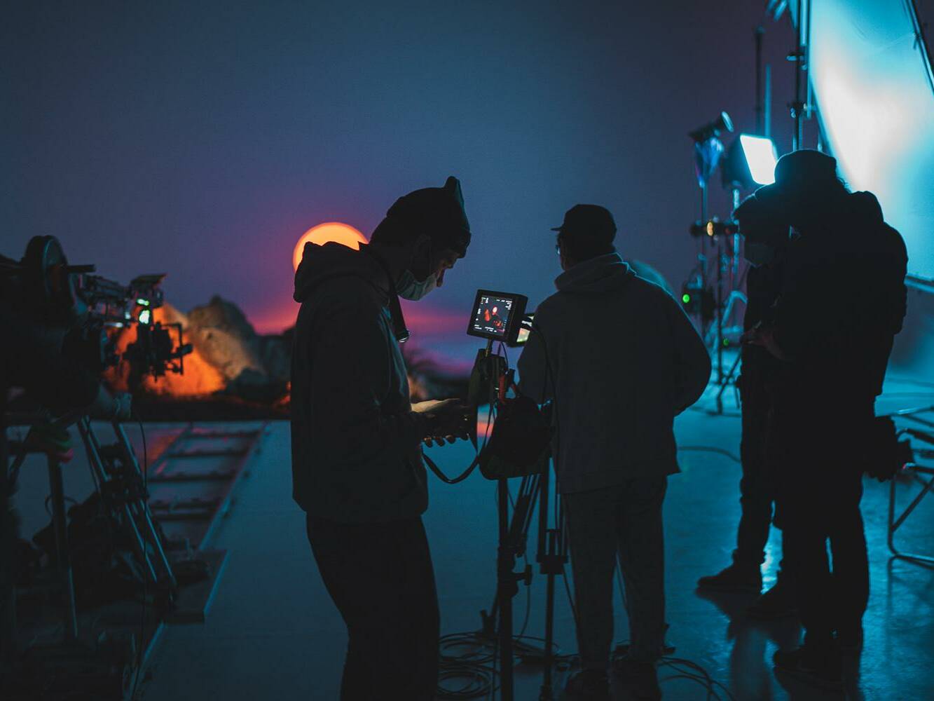
How we let for UTOPY a rock grow in the studio, parked a van on the Moon and made our own sunset for UTOPY.

Assignment
UTOPY prides itself on the principles of slow fashion community. Their clothing with unique designes is not only meant for fitness, but also as a lifestyle brand for everyday wear. The emphasis is on making women not only look good but also feel good in the clothing. The goal is to make two brand promoting videos and a series of photos that match the visual style of the videos.

Implementation
Our goal was to deviate from the ordinary view of fashion video and make the whole spot more artistic and abstract. So we immediately crossed out the idea of the actors thoughtlessly walking through various spaces and thought about what really characterizes UTOPY. When we were looking at the colors and patterns that UTOPY uses, words like speed, variety and agility came to mind. We wanted the viewers to see that they could feel good looking in their clothes, that they could feel “alive”.
"Feel alive feel UTOPY"
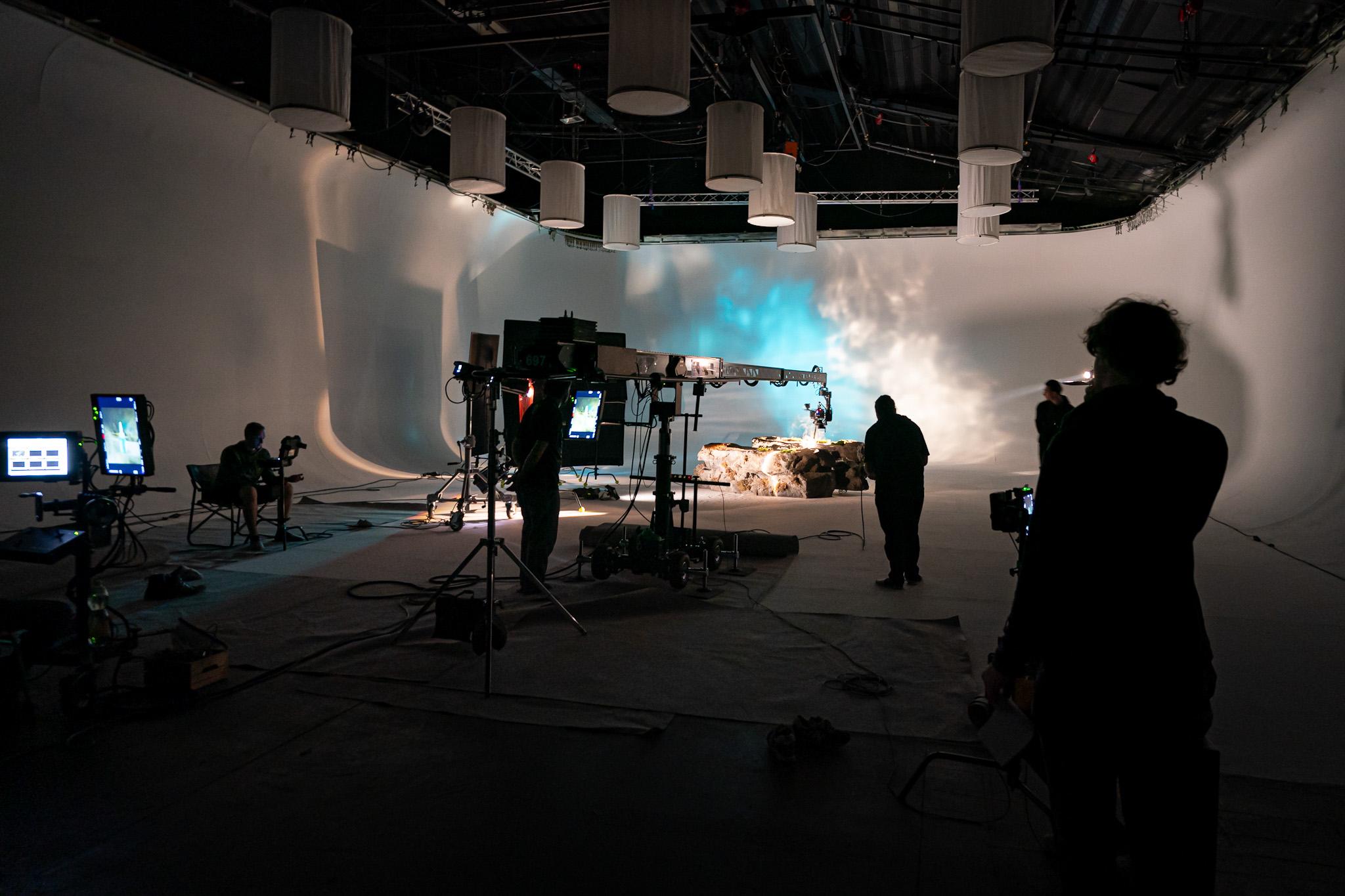
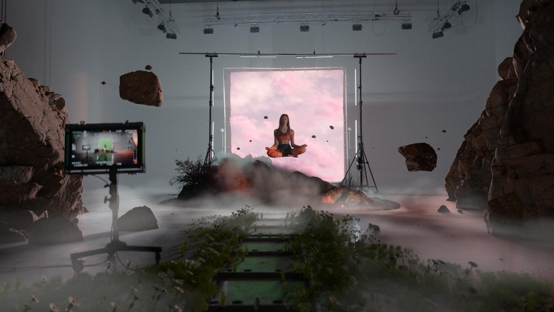
The world of UTOPY that we wanted to create cannot be found in nature. In addition to that, the winter season, during which the spots were filmed, is not exactly great for shooting outdoors in leggings and sports bras only. So we decided to create the whole world ourselves. And not only with the help of modified landscape shots, but also directly in the studio itself.
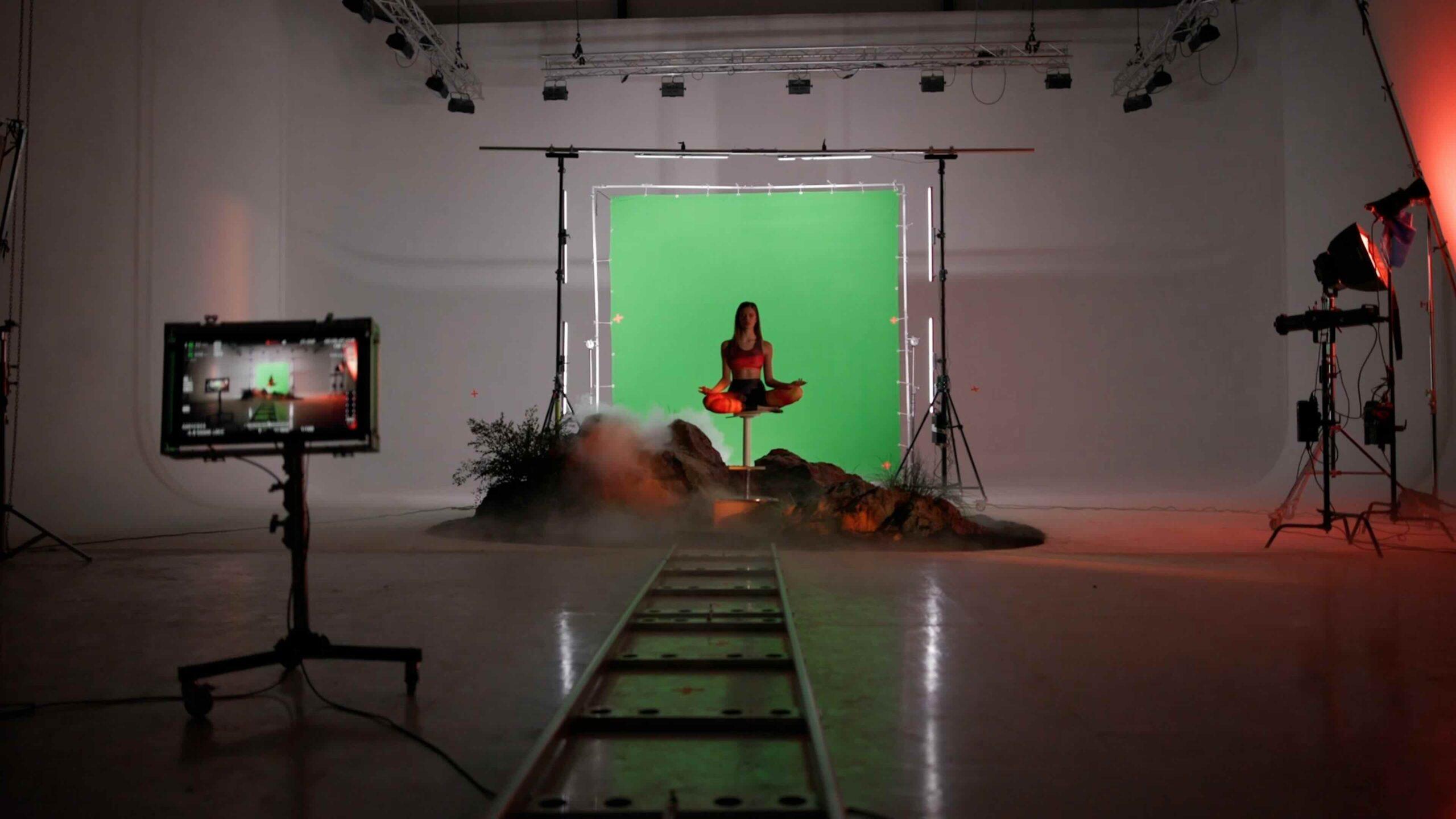

The patterns on the products themselves are resemble an abstract landscape. Using a macro shot, we used the fabric as a “portal” to the world UTOPY gets its inspiration from. We wanted to show that there is a lot more hidden in this brand.


What did the shooting look like?
Unfortunately, we didn't manage to film the transport of the artificial rock on the roof of the van, but you can at least take a look at how a rock like that is created directly in the studio.
Are you considering carrying out a similar project?
Let Ondra know
+420 723 801 250ondrej.repaty@unreal-visual.com
Or use our form and we will simply get back to you.

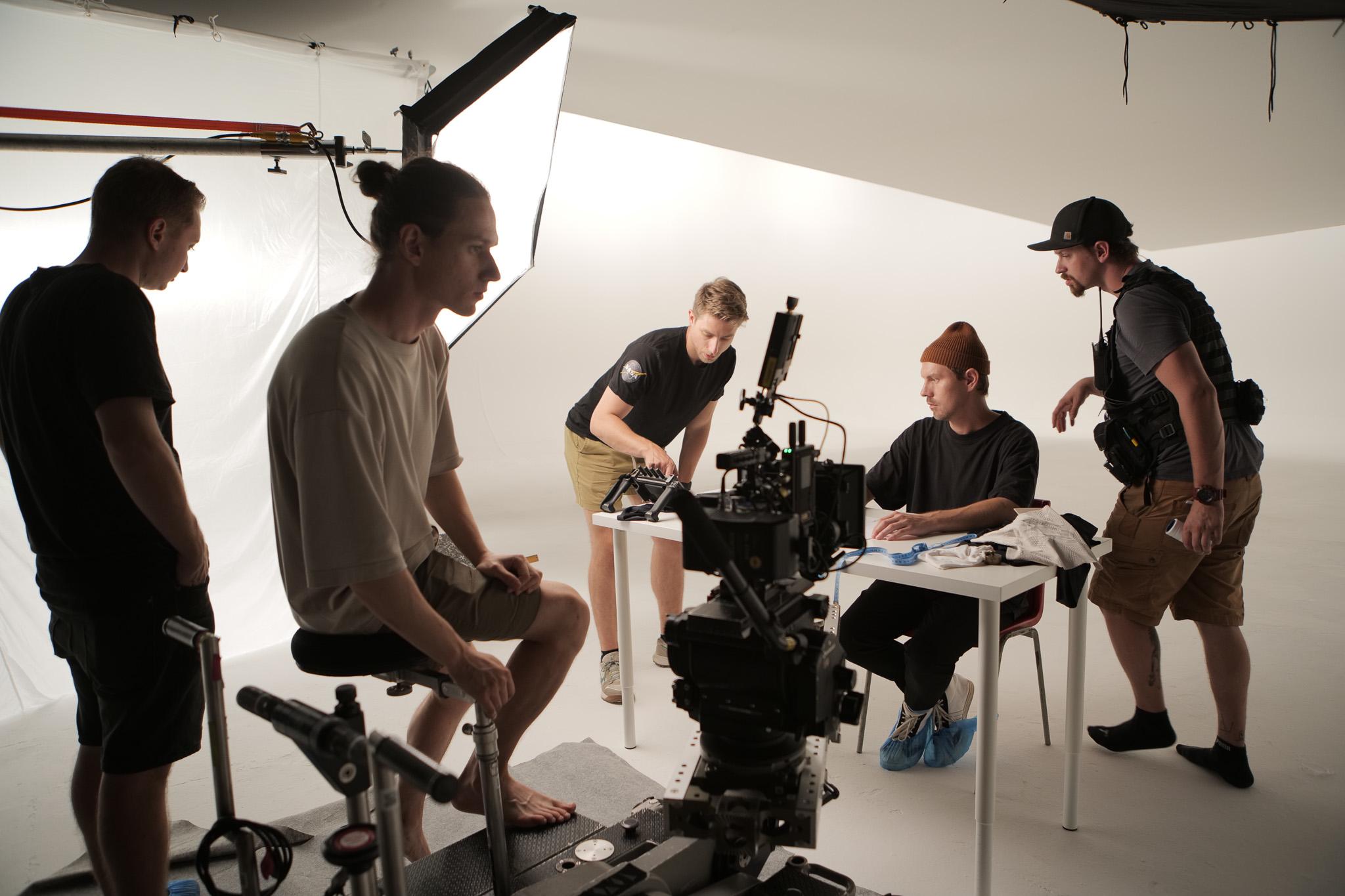
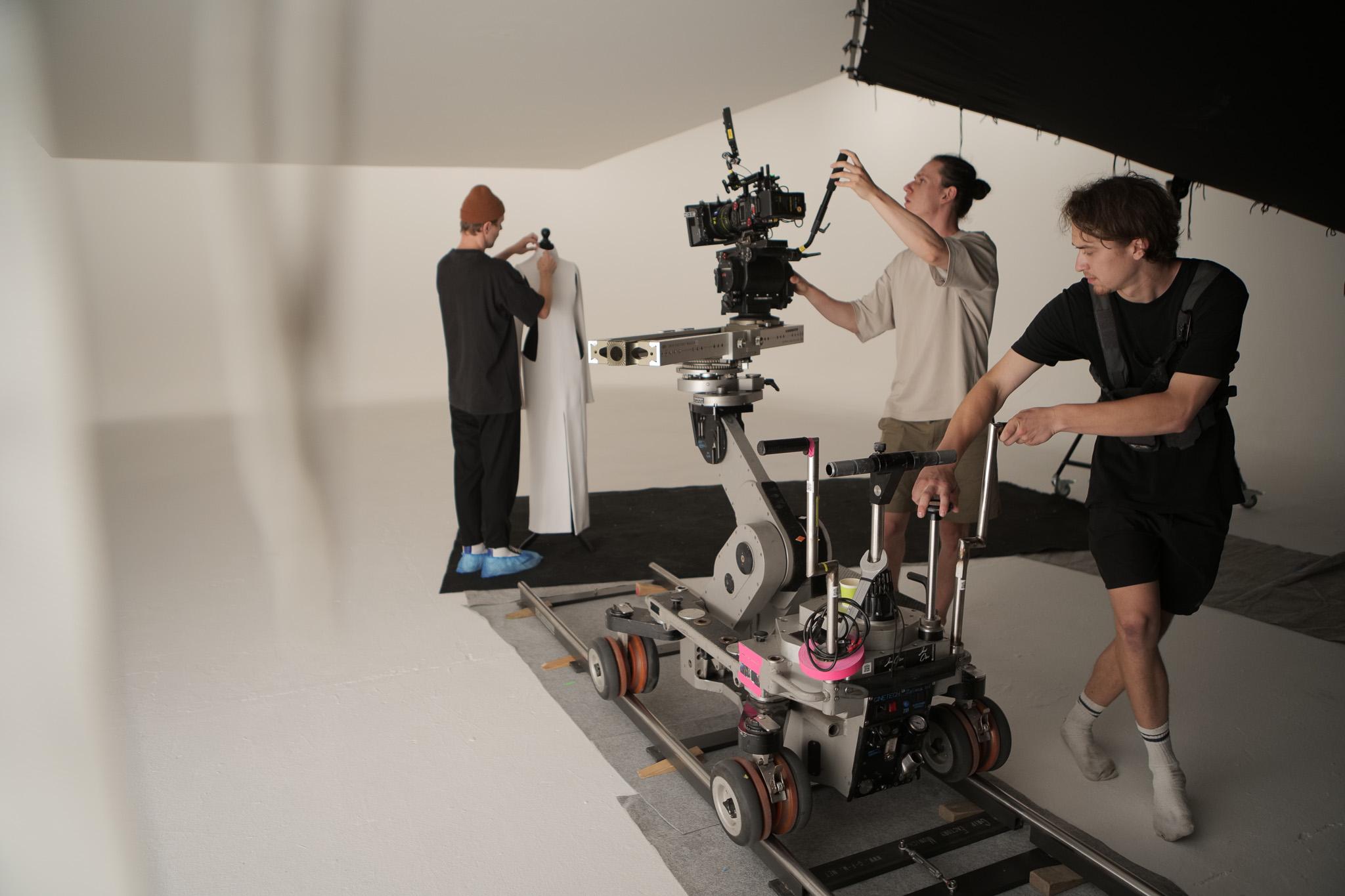
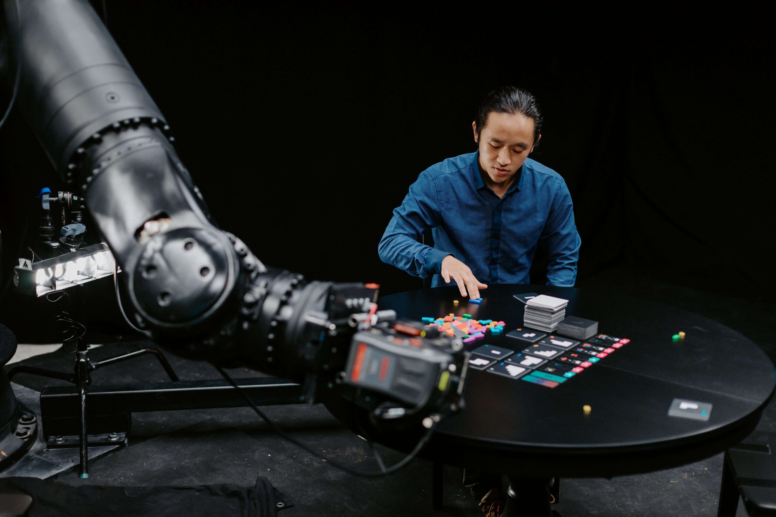
Project L
Project L
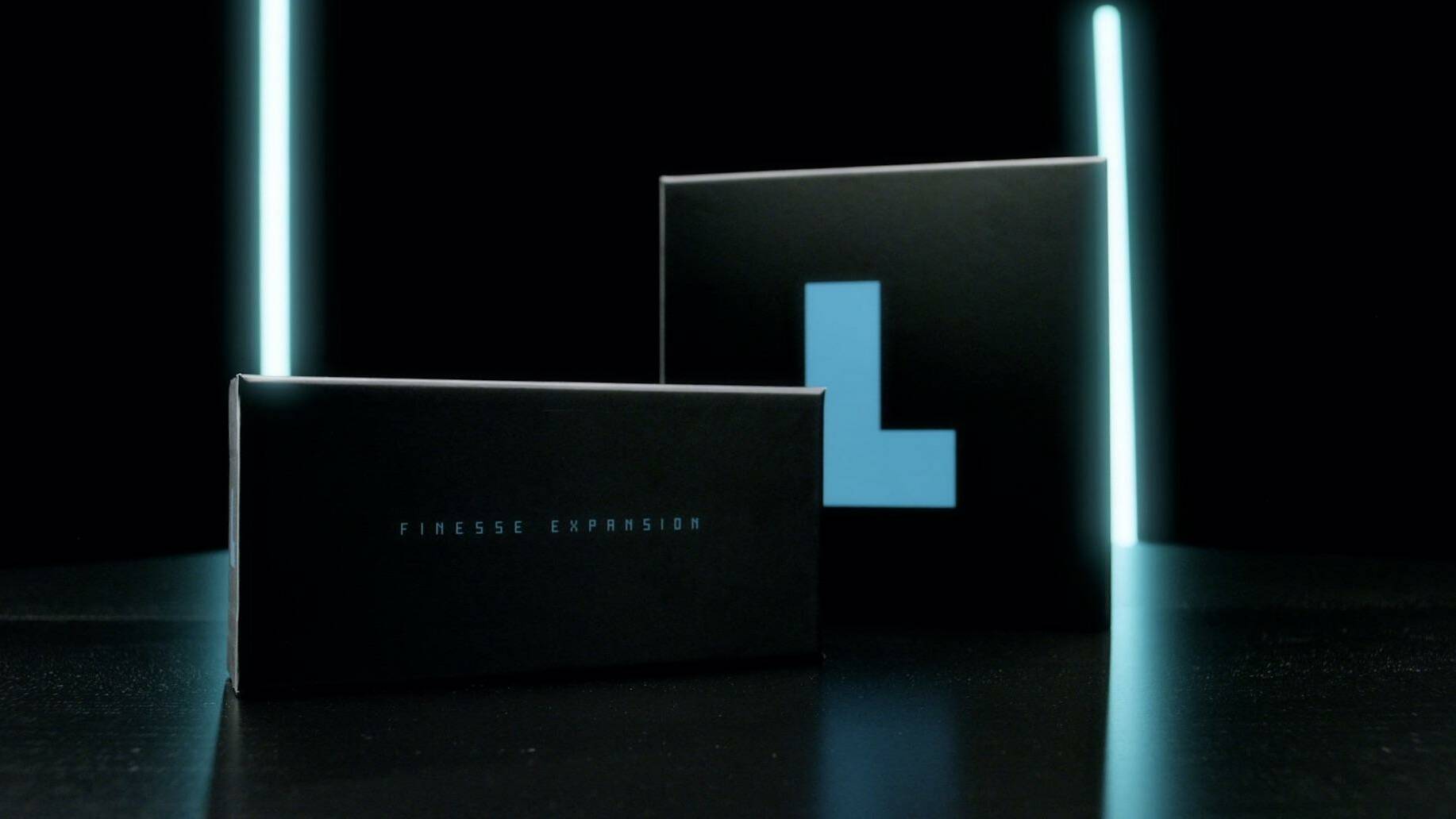
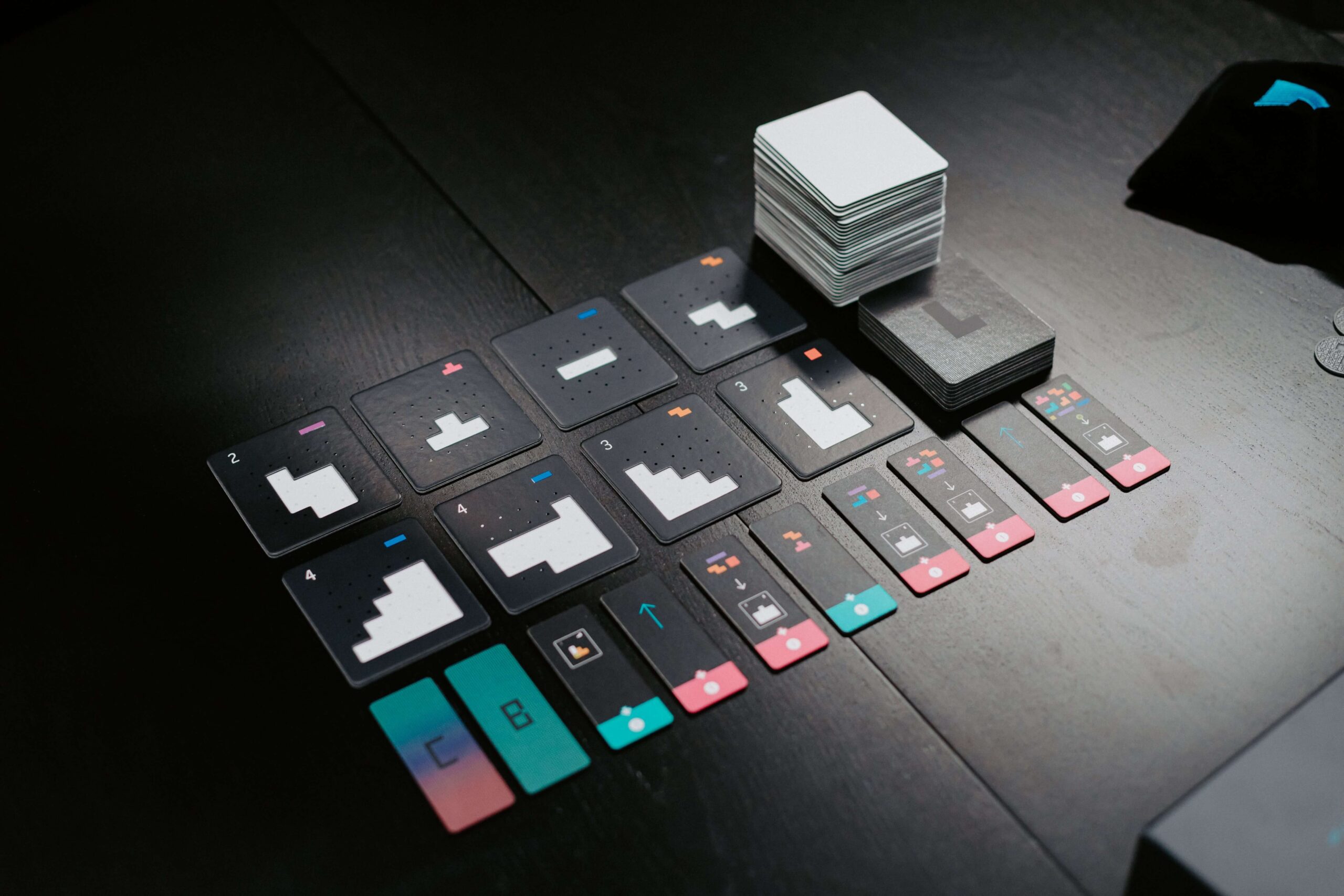
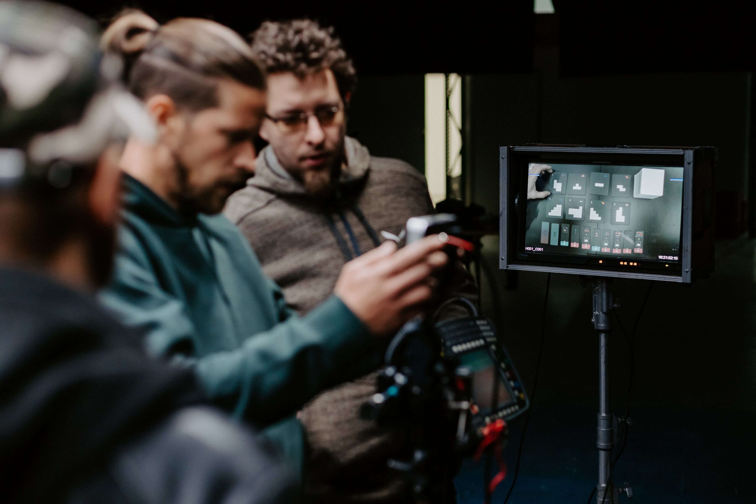
In just 20 minutes, Project L reached its target amount on Kickstarter. A board game, for the campaign of which we created a somewhat unconventional form of advertising video.
Assignment
The aim of the advertising spot for Kickstarter is to present the board game Project L with the Finesse expansion. In addition to introducing the basic functionality of the whole game, it is also important to show that the game is really for everyone. All this in an engaging way, so that the project reaches the set financial goal of €15,000.


Implementation
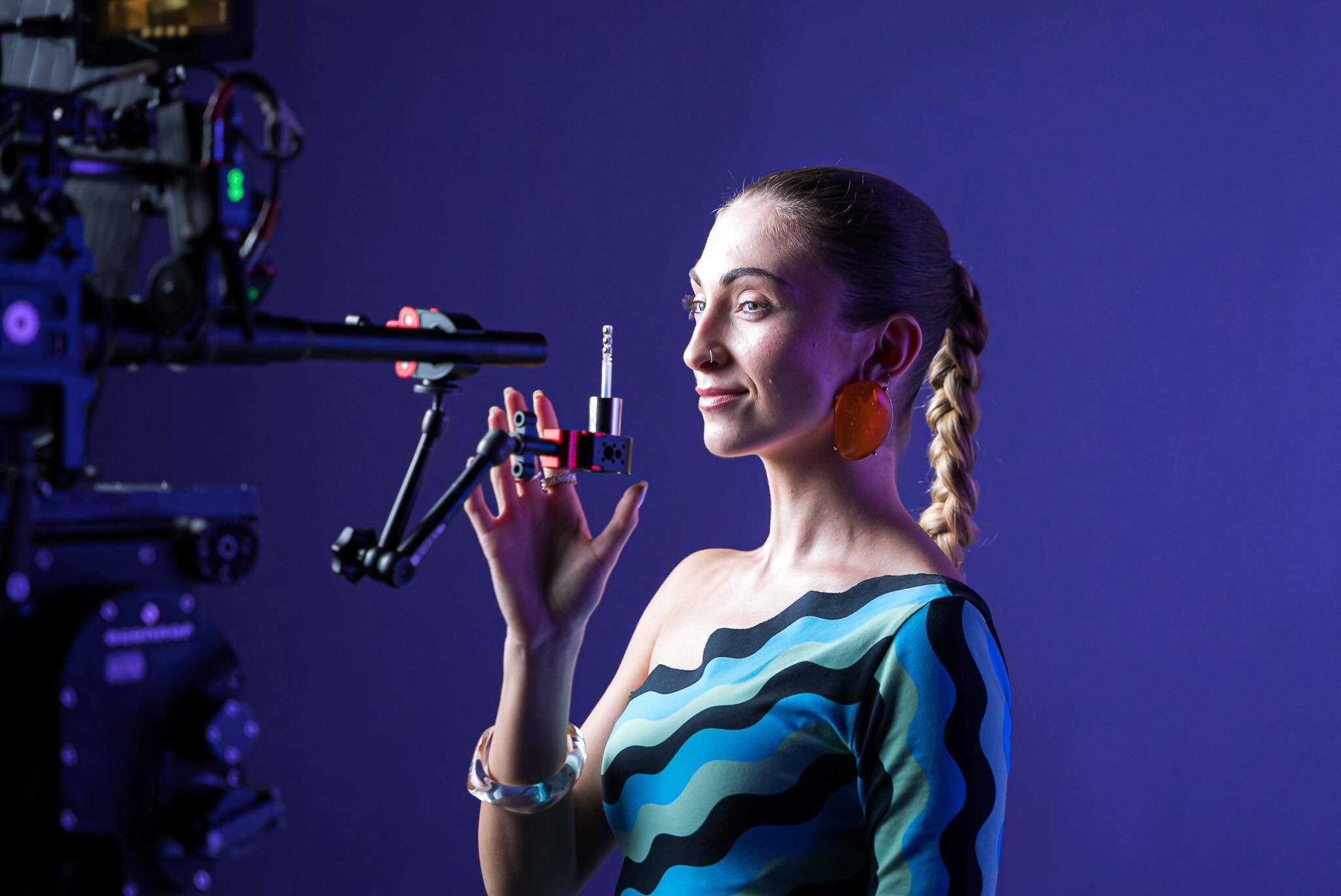
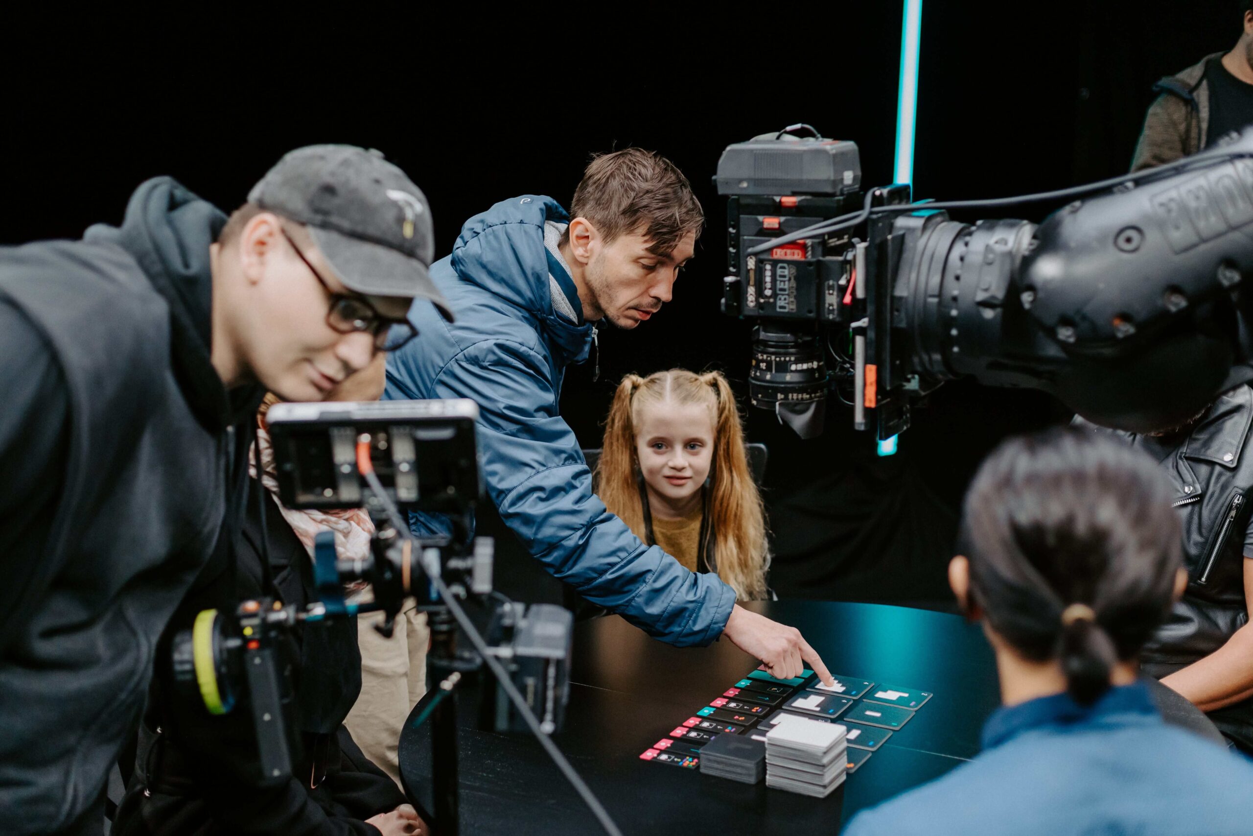
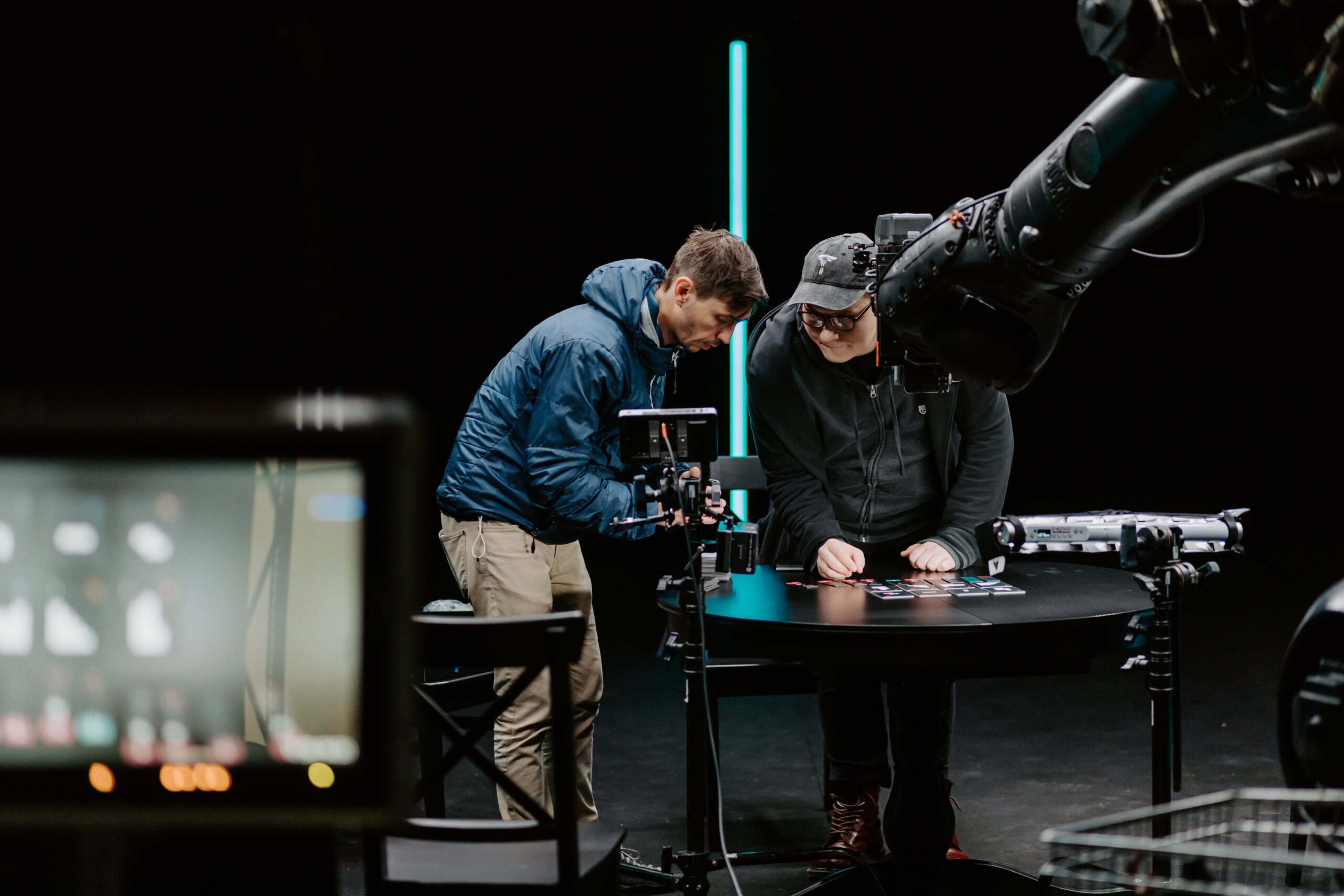
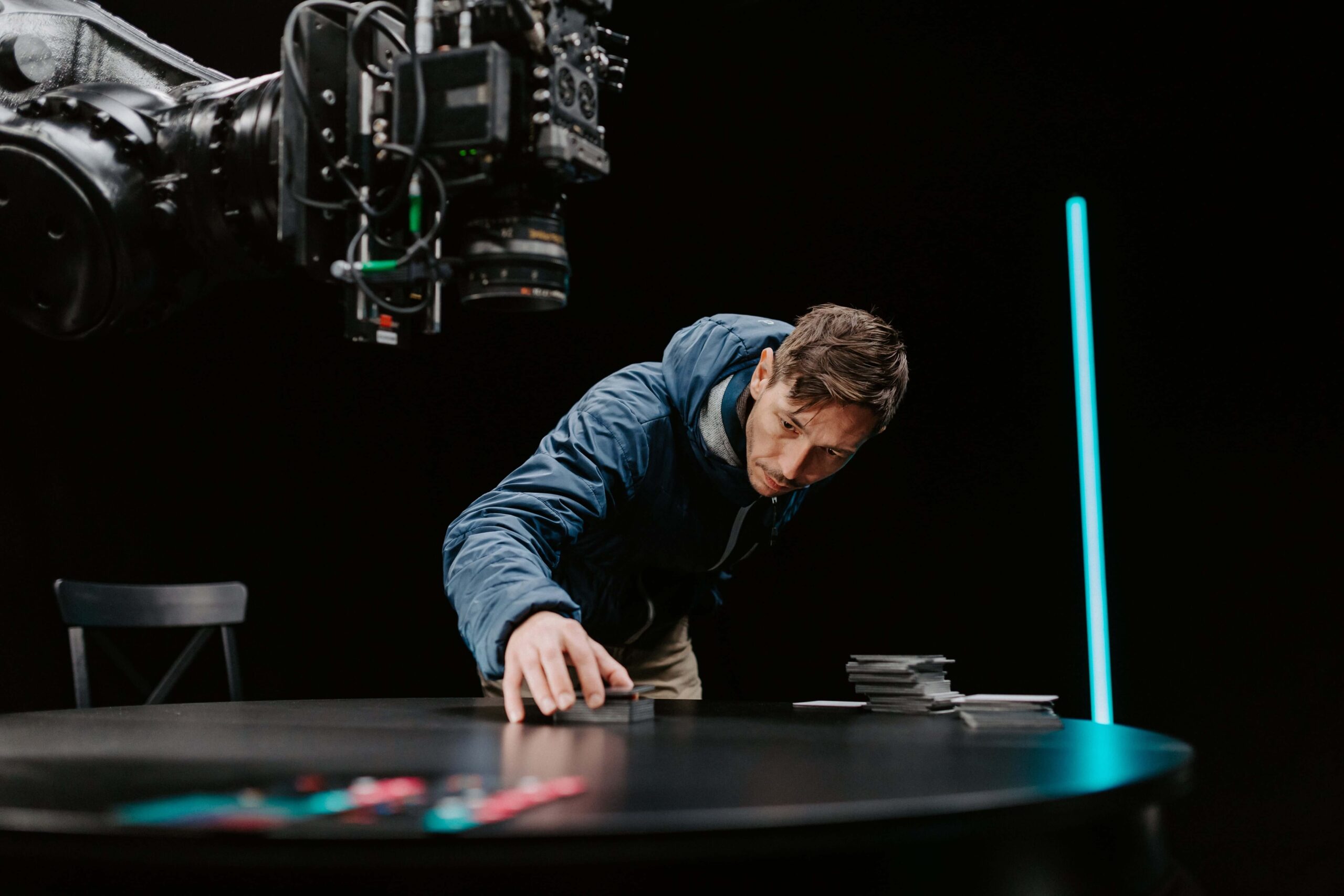
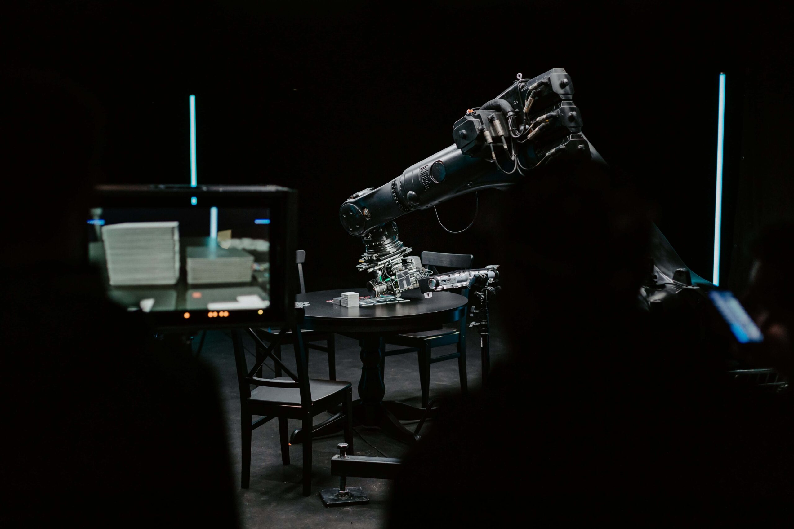
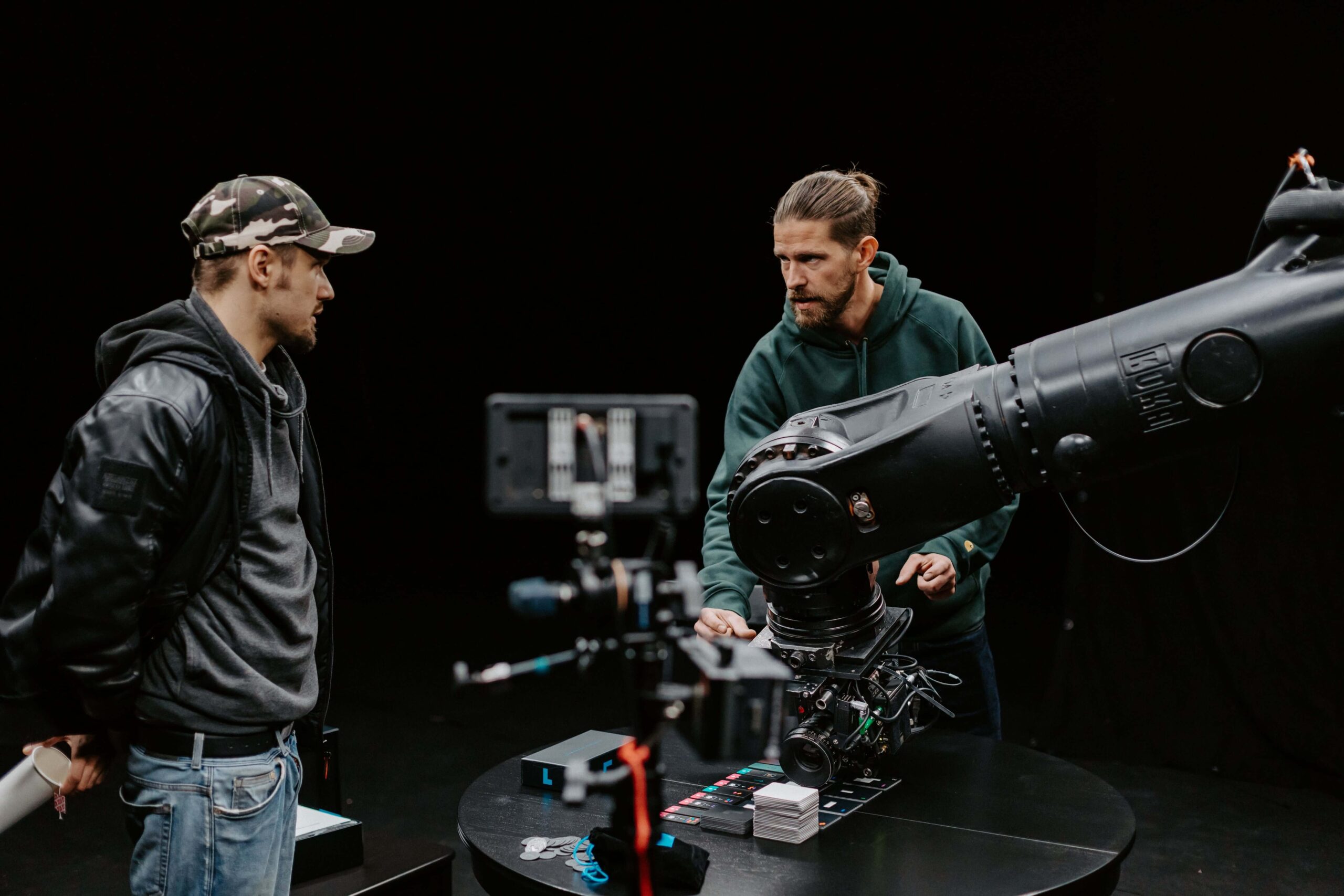
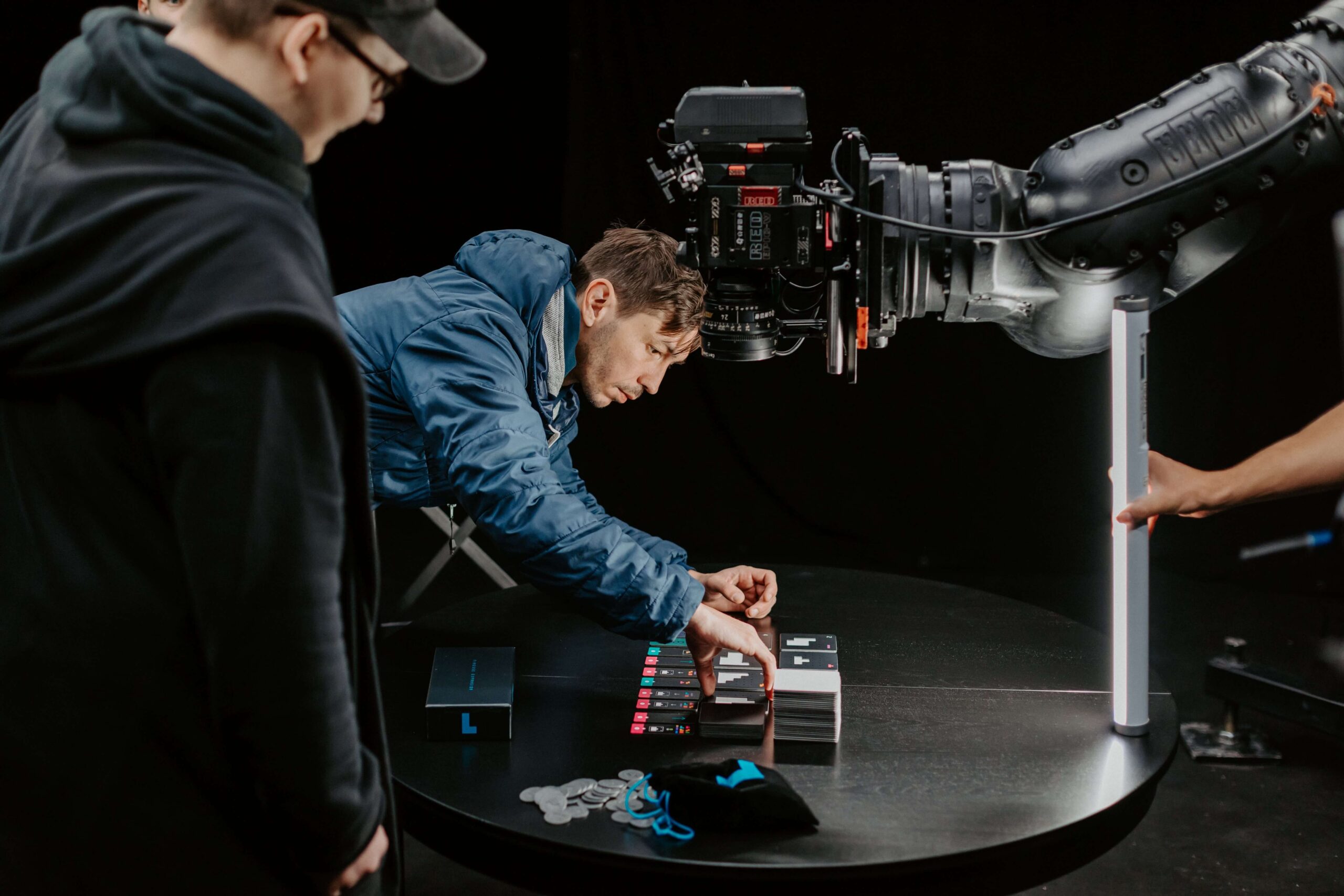
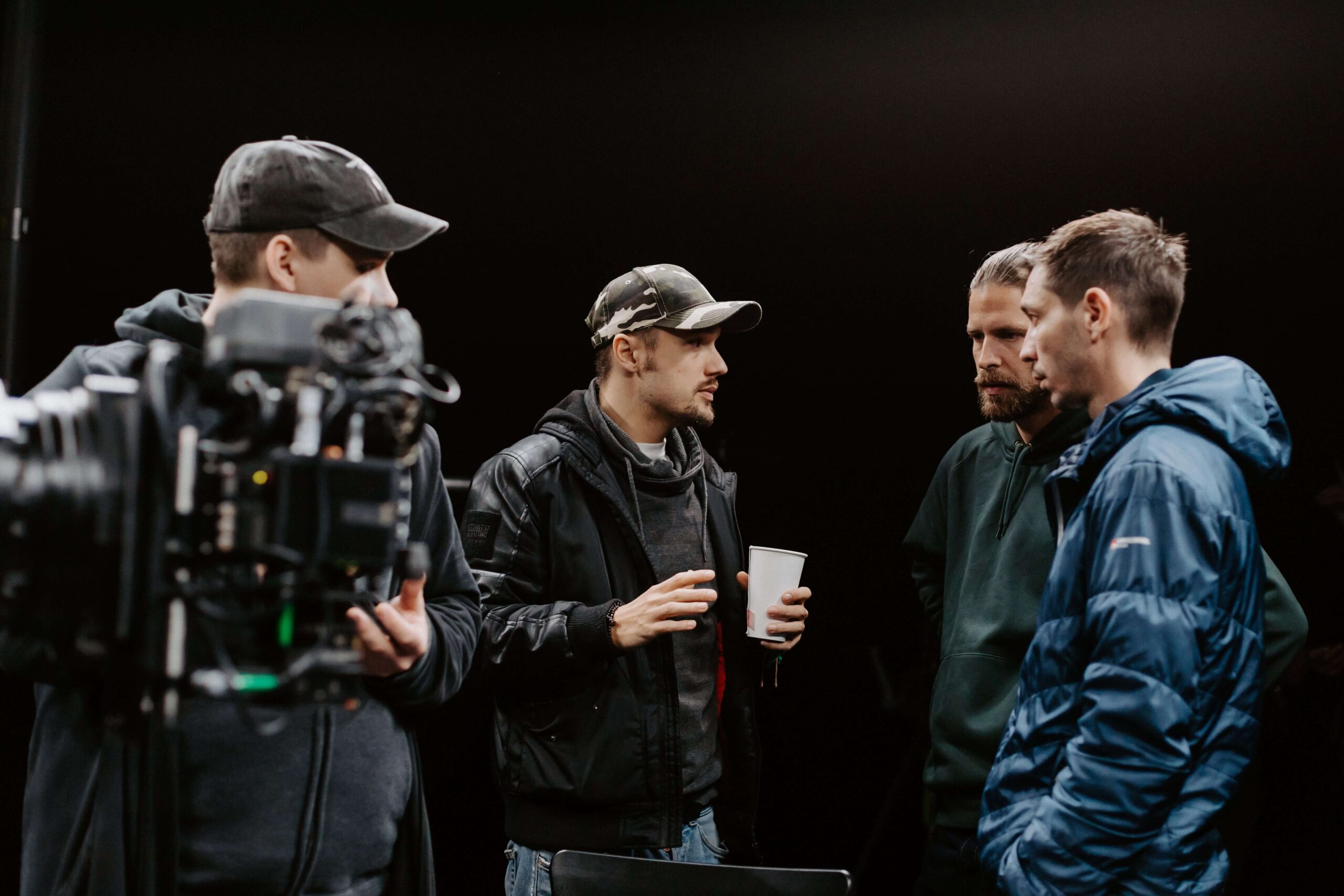
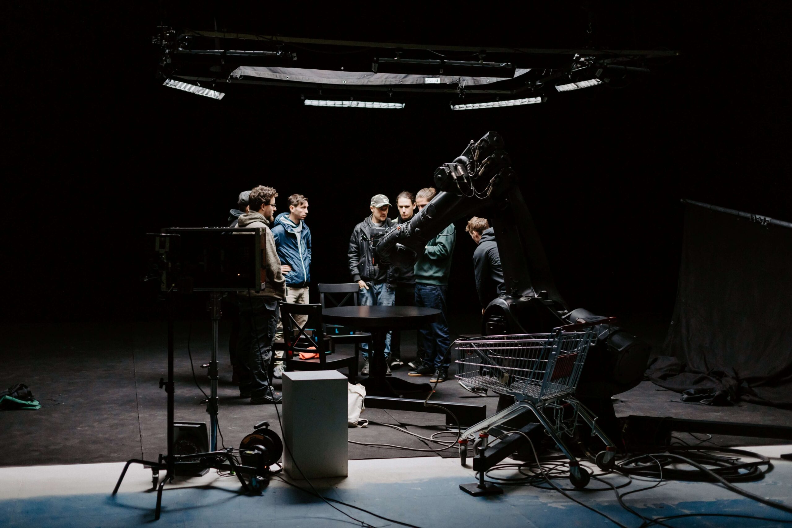
The audience on Kickstarter is discerning. Almost every day, dozens of new projects are created there and they fight for attention not only with their functionality, but also with their well-thought-out advertising campaigns. We had been entertaining the idea of using a robotic arm for shooting for a while. And what would be a better occasion to use it than Project L.
ROBOTIC ARM
The typical use of the robotic arm for only a few non-standard shots, however, seemed too little for the discerning Kickstarter audience. That is why we decided to make everything so that with the help of invisible cuts the video would look like one long uninterrupted shot.
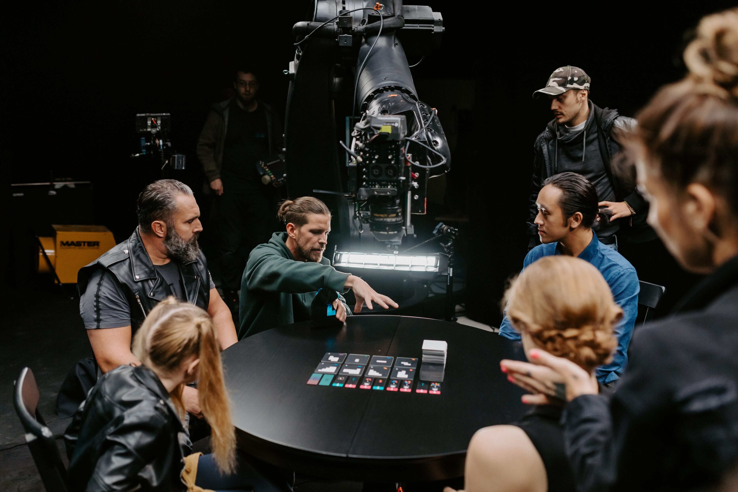
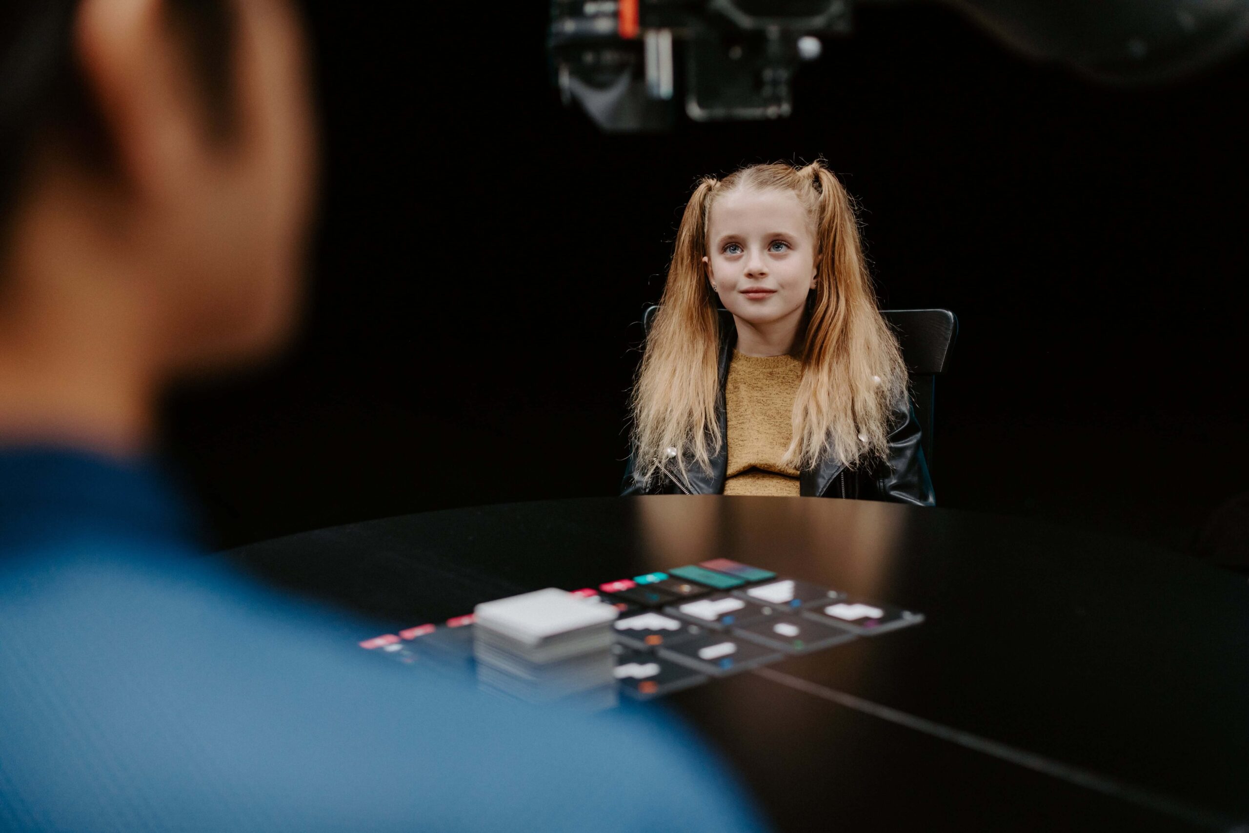
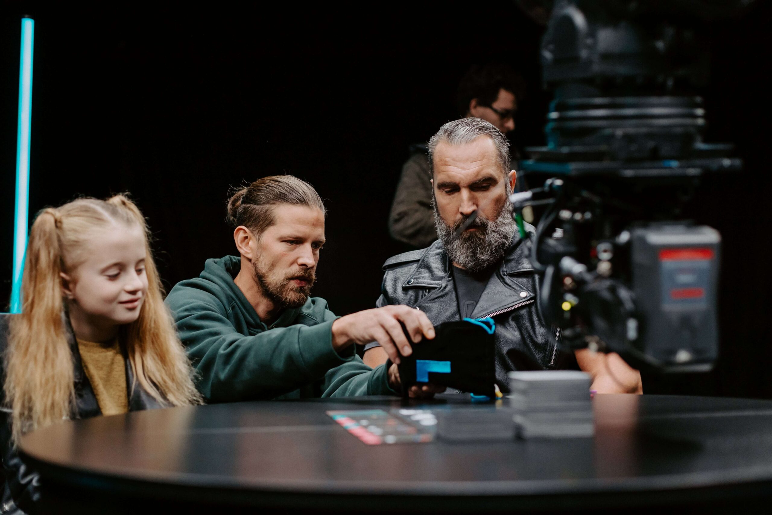
But how to bring all target groups together?
Seat the types of people you wouldn't expect together at one table and give every one the same goal. To win at all costs. :)


Result
In just 20 minutes from the launch on Kickstarter, the amount exceeded the required €15,000 and reached an incredible amount of €401,602.